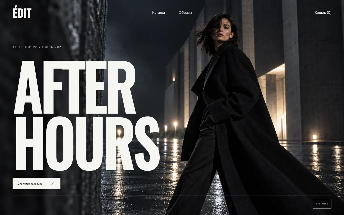
Fashion showroom / clothing store
ÉDIT · MIDNIGHT RUNWAY
A night-time showroom for a clothing brand: from campaign to cart in a few steps. Every piece sells through texture, silhouette and exact sizing.
10 pages · $690
Details
Ready-made websites for business
69 ready-made sites, 20 niches. Explore the demos, check the mobile version and choose the one that fits your business. We adapt it to your brand and launch it.
Collection · 69 ready-made sites
Each website was created for a specific niche — with its own art direction, structure and sales logic. Most niches have several approaches: from a single page to a full website with booking, or an online store.
A night-time showroom for a clothing brand: from campaign to cart in a few steps. Every piece sells through texture, silhouette and exact sizing.
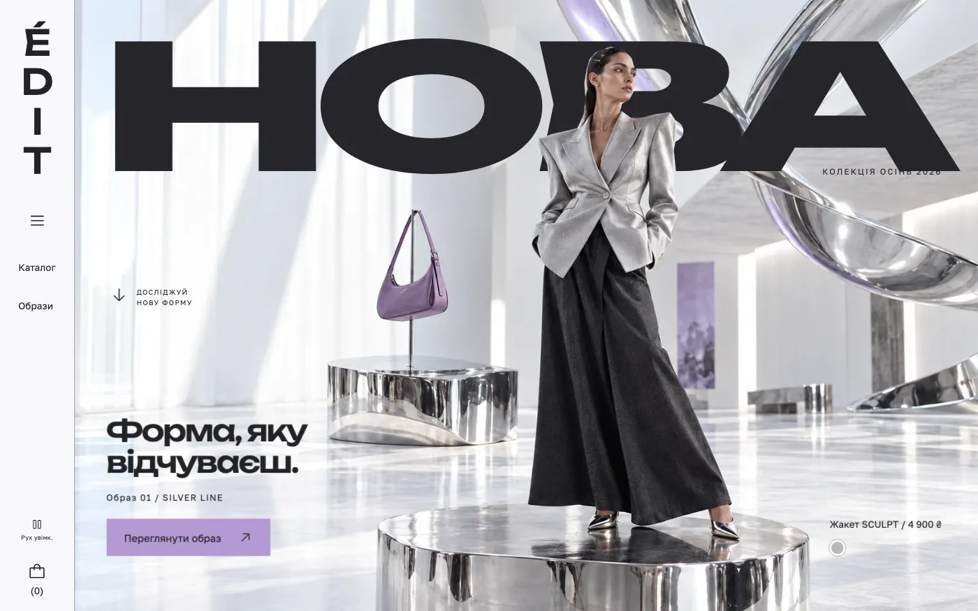
A gallery-style showroom for a brand that presents clothing, bags and shoes as art objects: every piece is displayed like an exhibit.
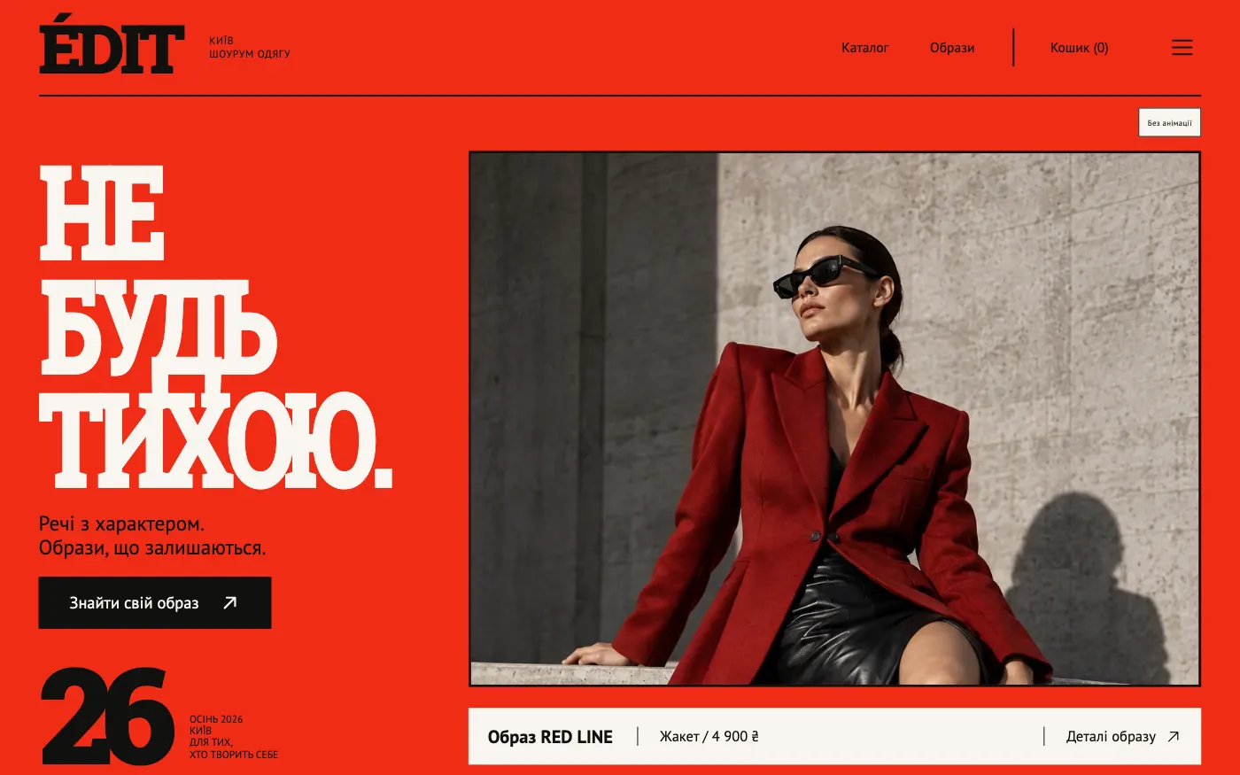
A bold red showroom for a brand that lives on vivid shoots: the collection is presented as a photographer’s contact sheet.
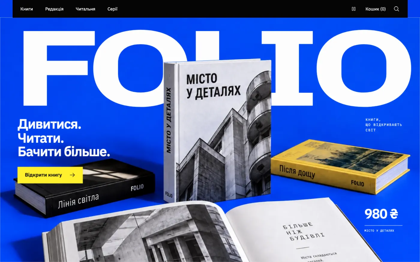
A vivid publisher’s website where a book is read first: an excerpt opens right on the first screen, and the cart is one step away.
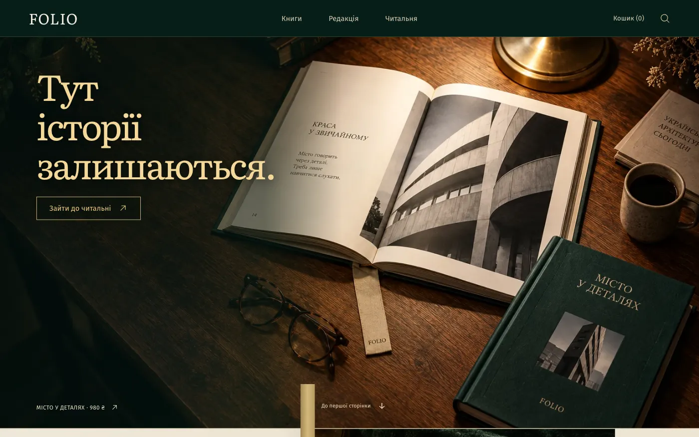
A quiet website for a bookshop or a fiction publisher: the reader opens the first page as in a library and only then chooses a book.
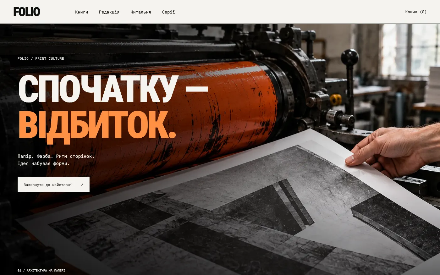
A website for a publisher proud of its printing: books are shown as fresh proofs from the workshop, with paper, ink and the rhythm of the pages.
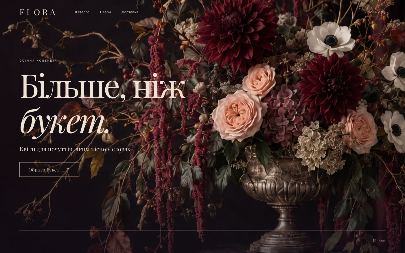
For a florist studio with premium signature bouquets. The site sells a gesture and a feeling, and the cart leads to an order with a card.
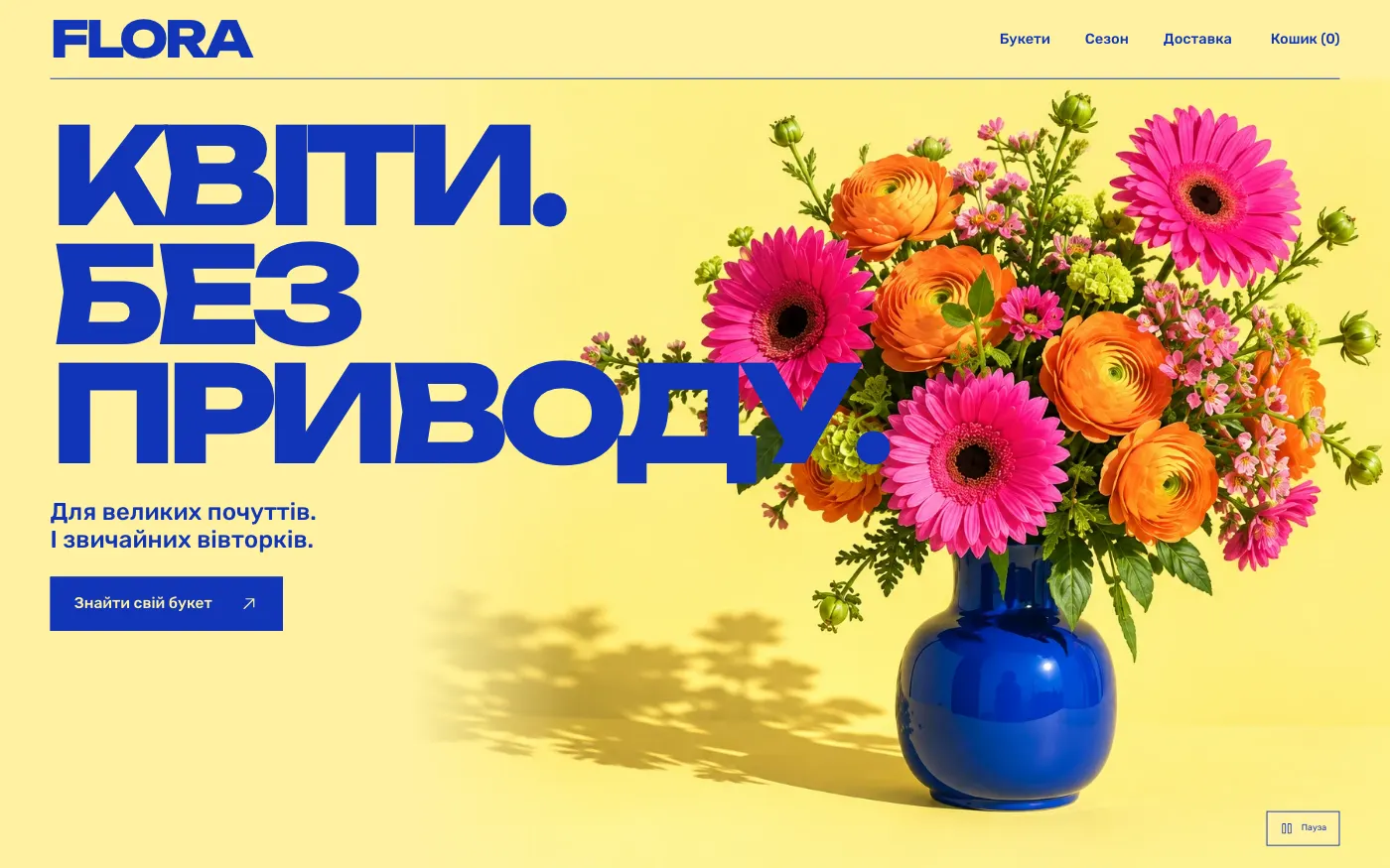
For a flower shop with city delivery. A bouquet “for no reason”: prices right below a bright poster, and the cart a few clicks away.
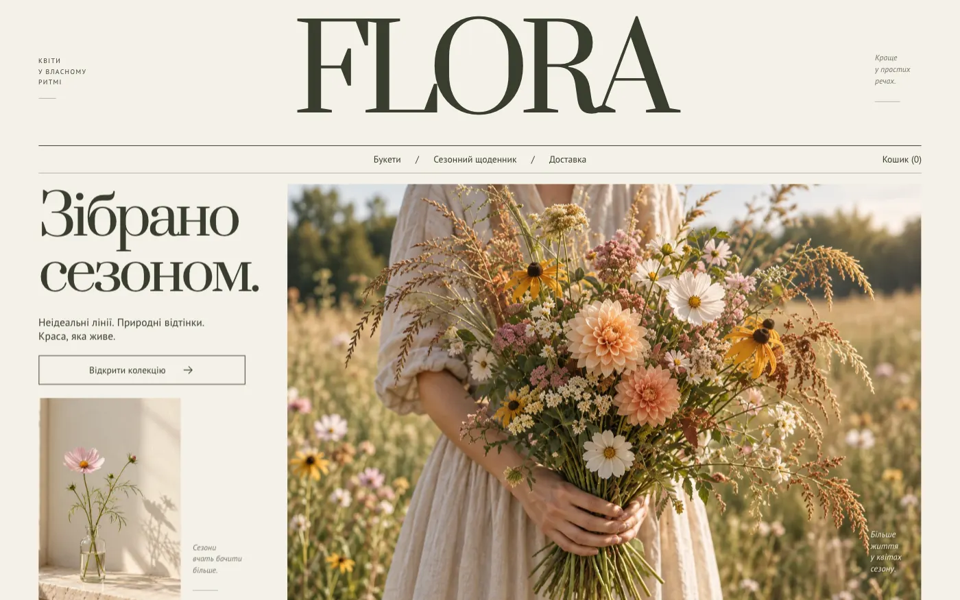
For a florist who works with seasonal and wild flowers. The site tells what is blooming now and sells a bouquet as a piece of the season.
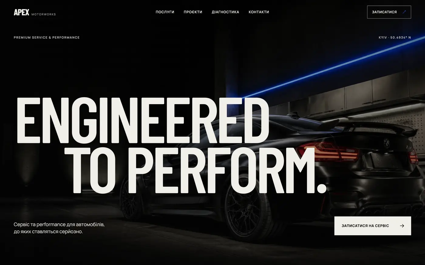
For a car service where expertise, trust and results are important. Shows the level of the workshop even before the first call.
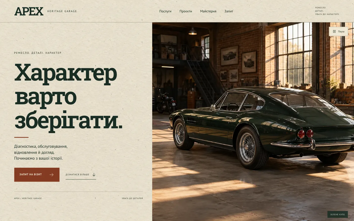
For a workshop that works on classic and characterful cars. A magazine-style site that sells respect for a car’s history before the first conversation.
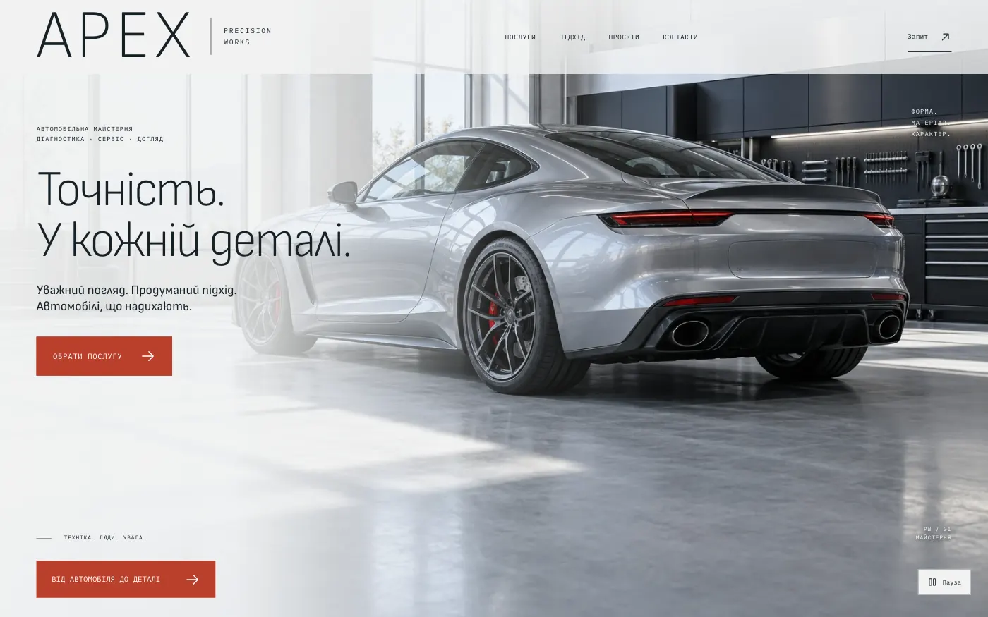
For a service that sells order and precision. The client picks one of four service areas and in a minute puts together a clear request about their car.
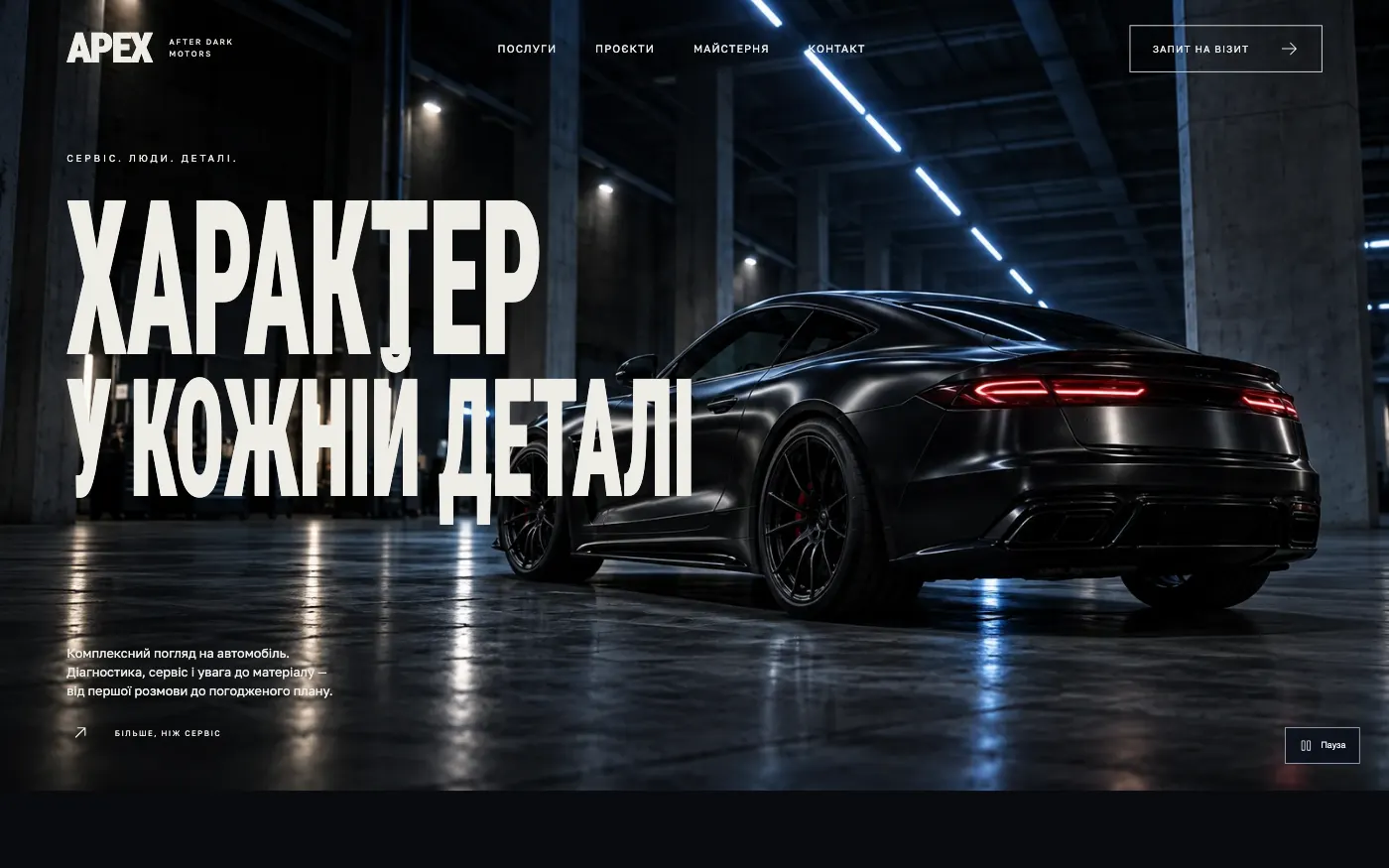
For a car service with a strong brand character. A night car poster with huge typography sells attention to detail and leads to an inspection request.
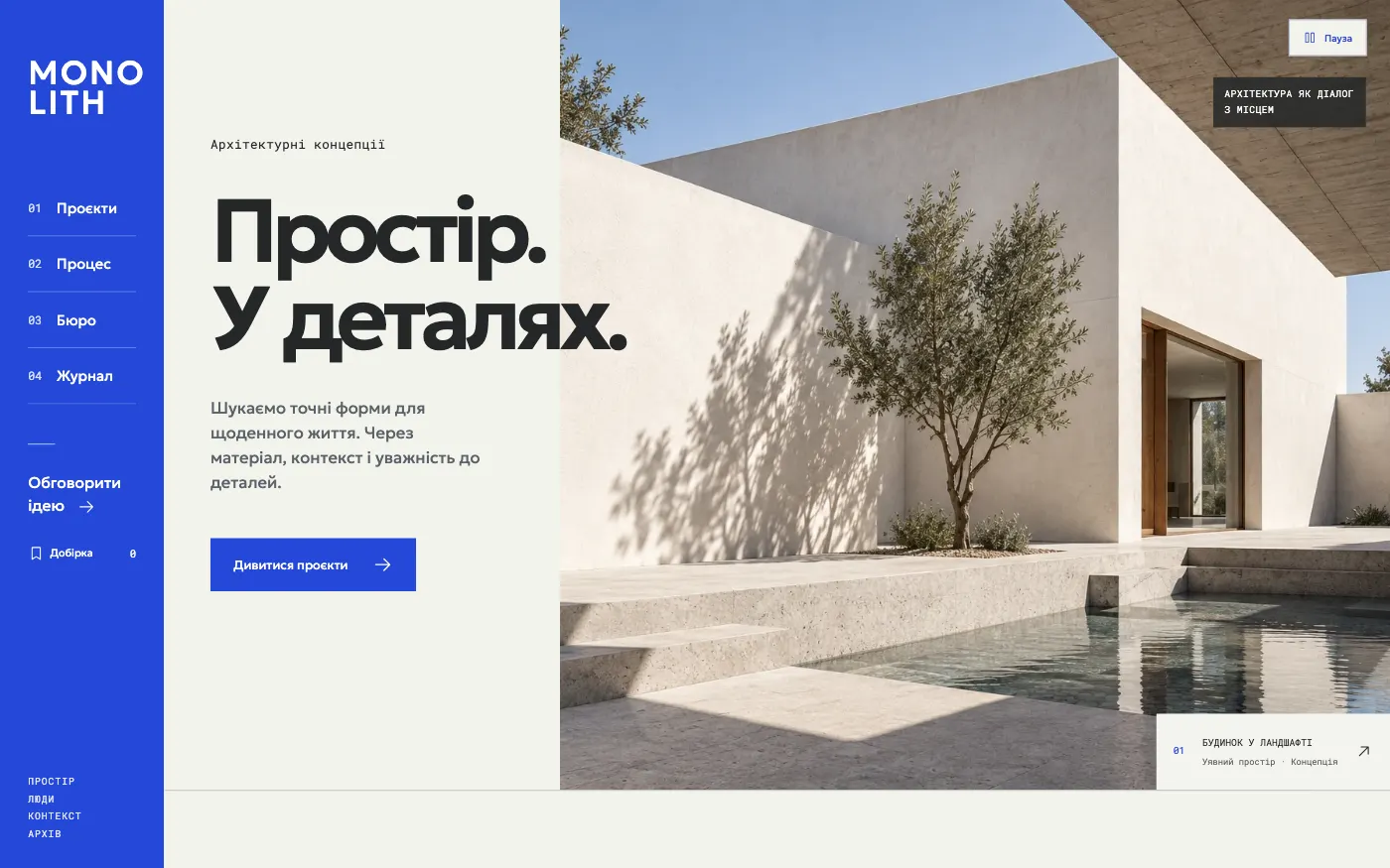
For an architecture studio that thinks like a researcher. An archive of concepts helps the client find a space they like and bring it into the brief.
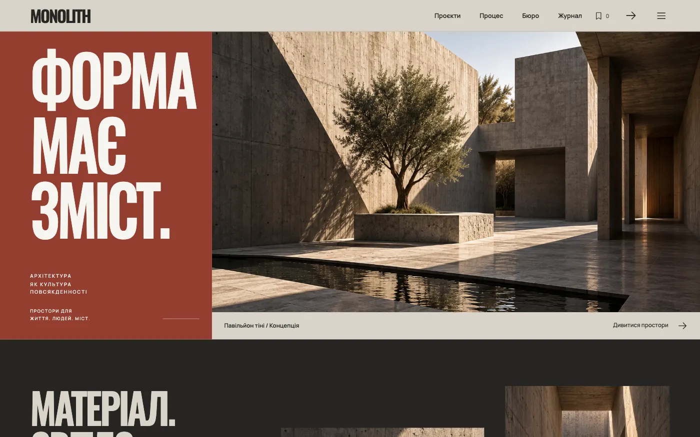
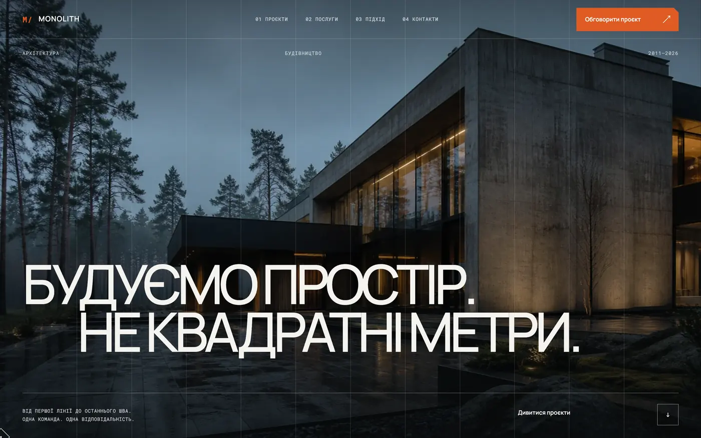
For a studio with its own personal style: concrete, brick, minimal decoration. A manifesto site shows how you think from the first screen and filters out “make it like everyone else’s” enquiries.
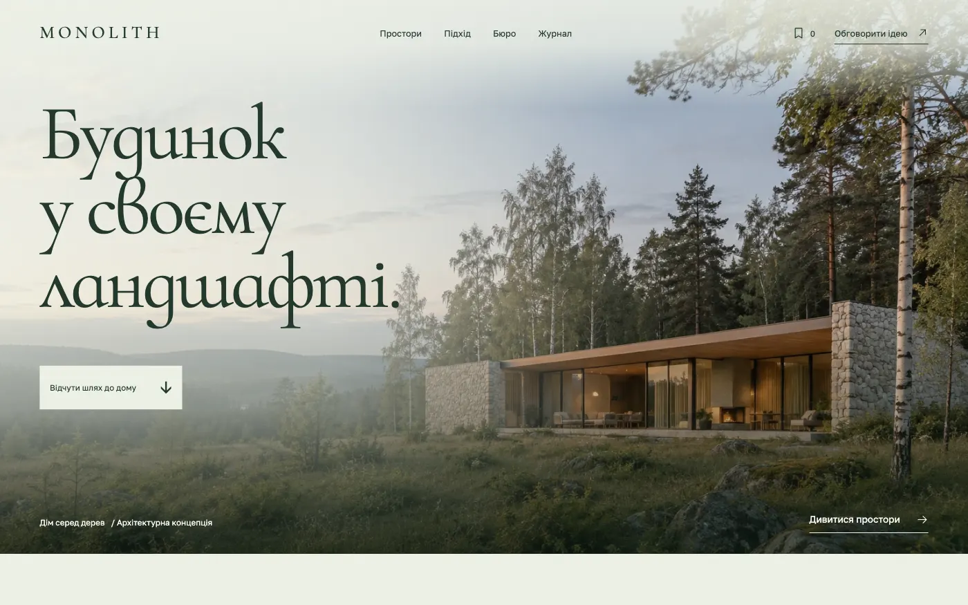
For an architect of private houses in nature. The site presents a house as part of the landscape and lets the client start a brief right from the first screen.
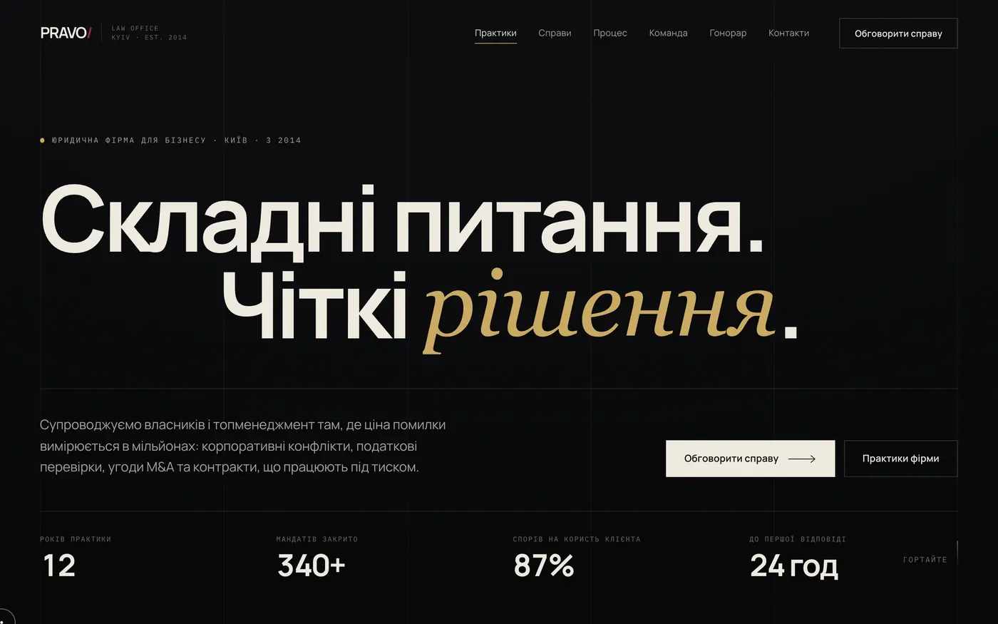
A discreet website for legal practice that creates a sense of competence, trust and control from the first screen.
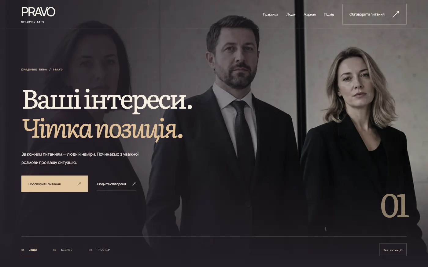
A law firm website where every practice area is backed by people and real situations. Clients find their topic and arrive at the conversation prepared.
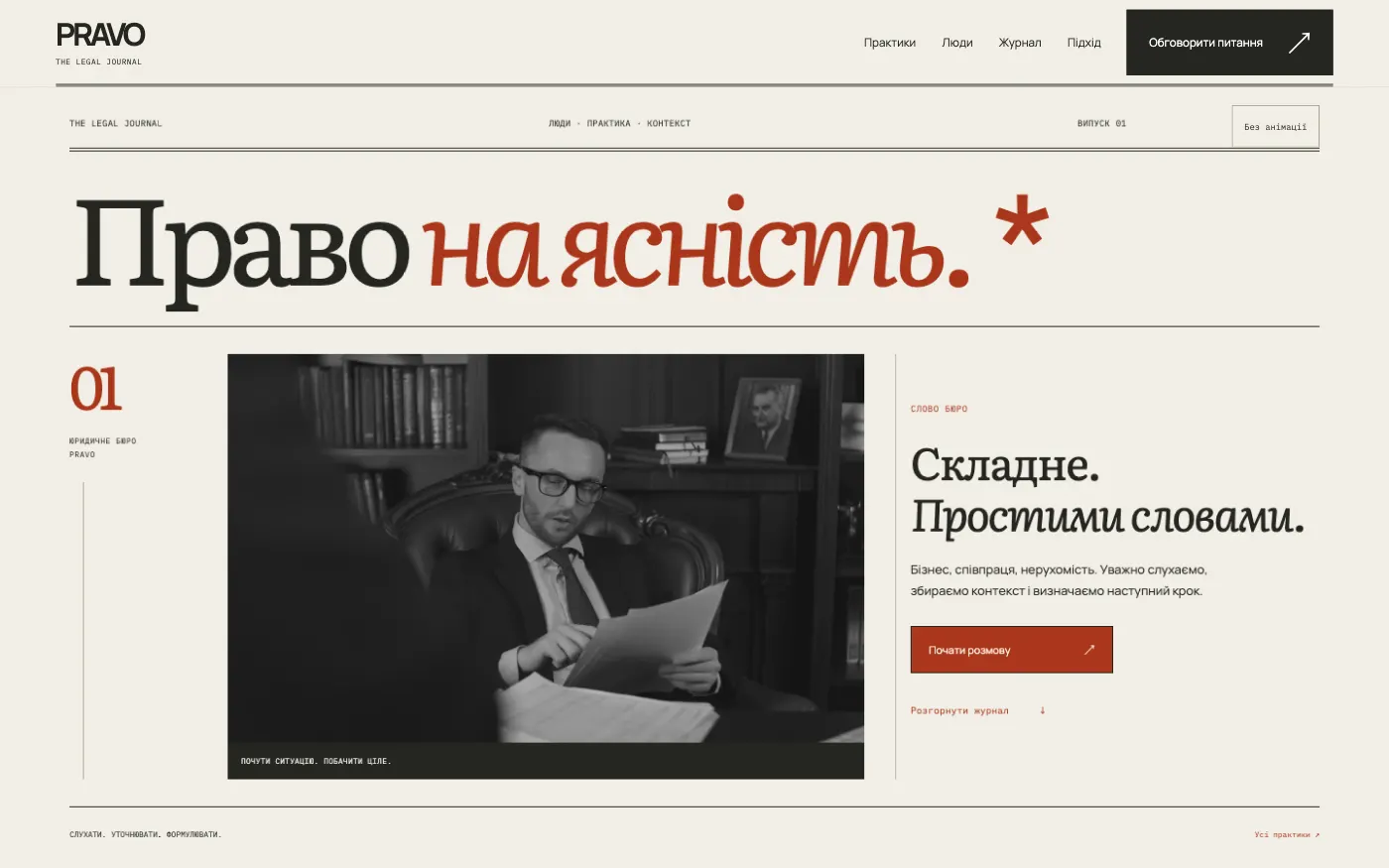
A firm website in the format of a legal journal: expertise shows through the writing, and practice areas and the enquiry open like the contents of an issue.
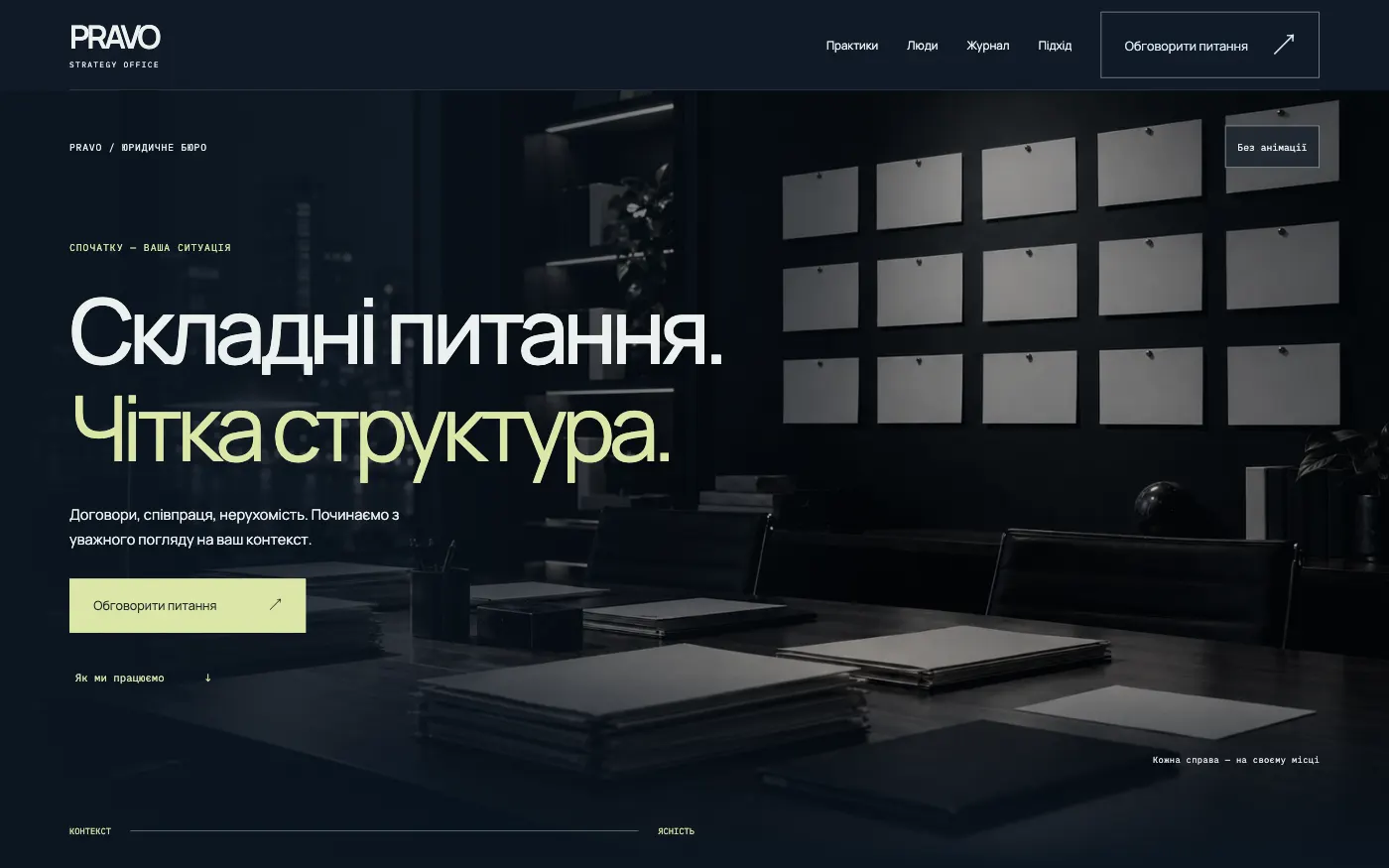
For a firm that supports businesses: the site shows how the work goes — from circumstances to agreement — before the first meeting.
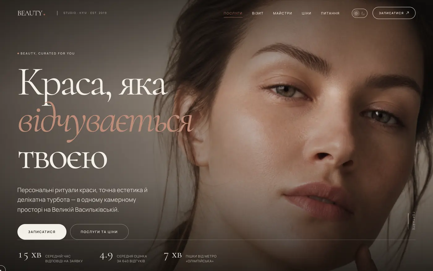
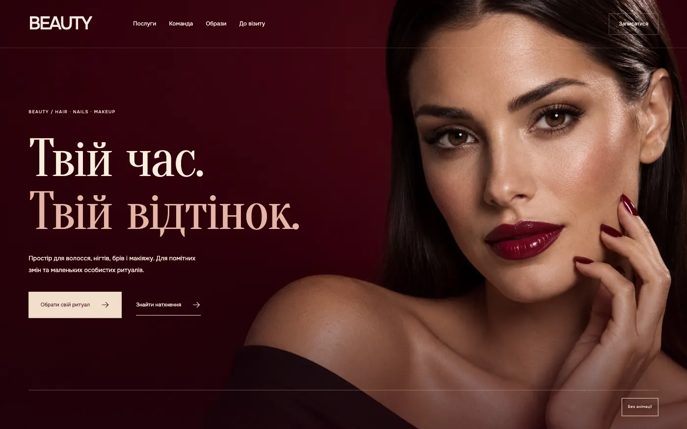
For a salon that sells time for yourself, not procedures. A gentle menu of rituals with demo prices, stylists and looks leads to booking.
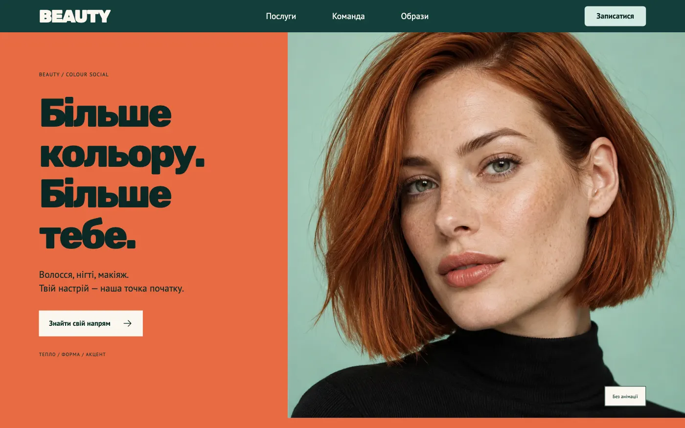
For a vibrant salon with a young audience. The site speaks the language of Instagram: colour, looks, the team — and booking in one form.
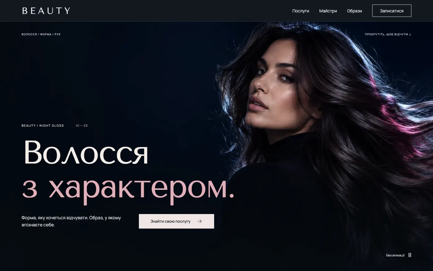
For a city-centre salon with an evening, fashionable mood. The client chooses a look, sees who will create it and writes a wish list.
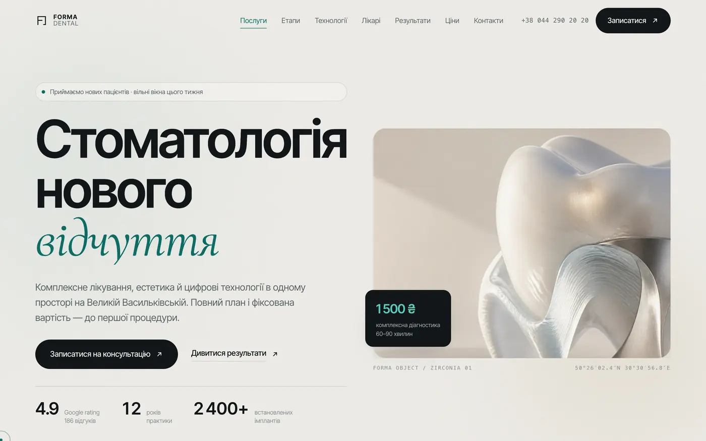
A site for a clinic that should be trusted even before the first visit. Shows modernity, transparency and care for the patient.
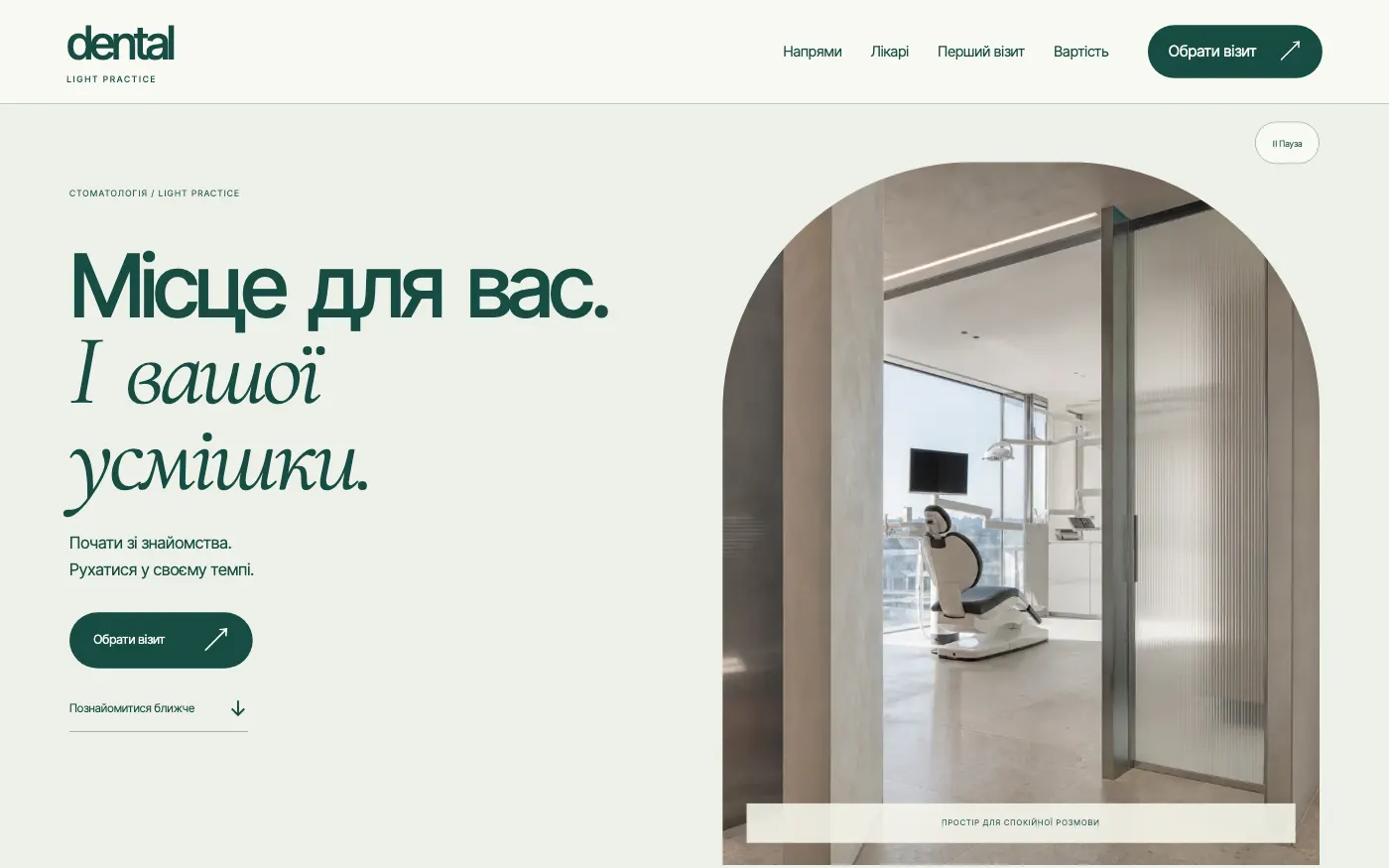
A dental clinic website that removes the fear of the first visit: a light consulting room, a familiar doctor and a clear path from question to booking.
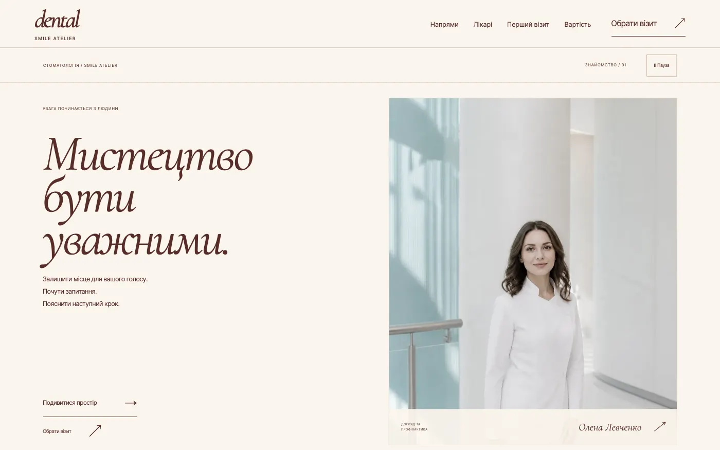
An aesthetic dentistry website in the manner of an atelier: the person, the space and a conversation. The patient chooses a topic, and booking already knows the doctor.
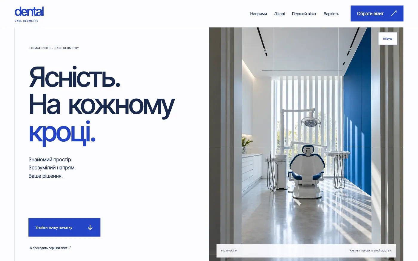
For a clinic with several treatment areas: three numbered entry points, and in a minute the patient knows where to go and how to book.
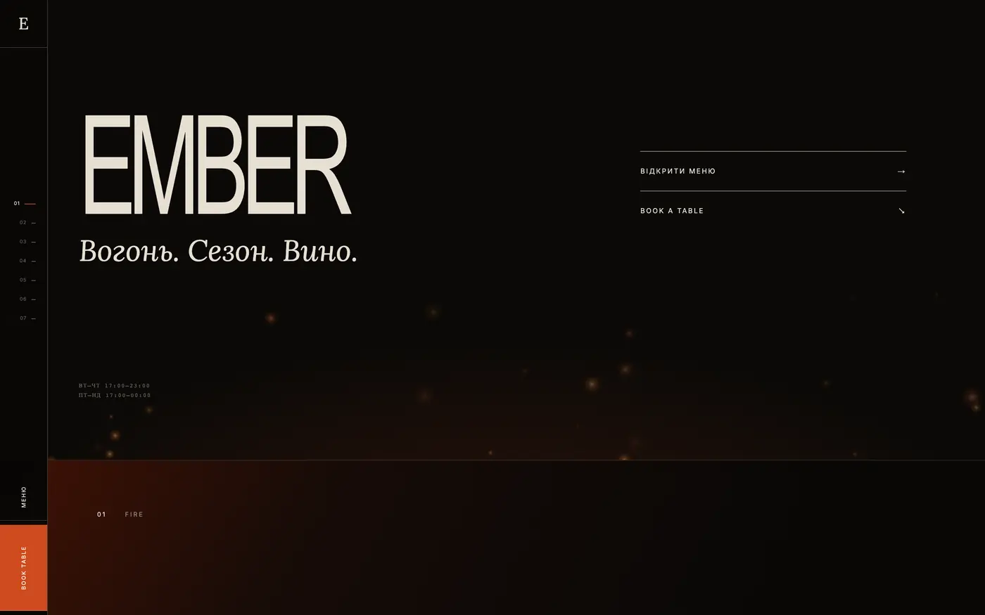
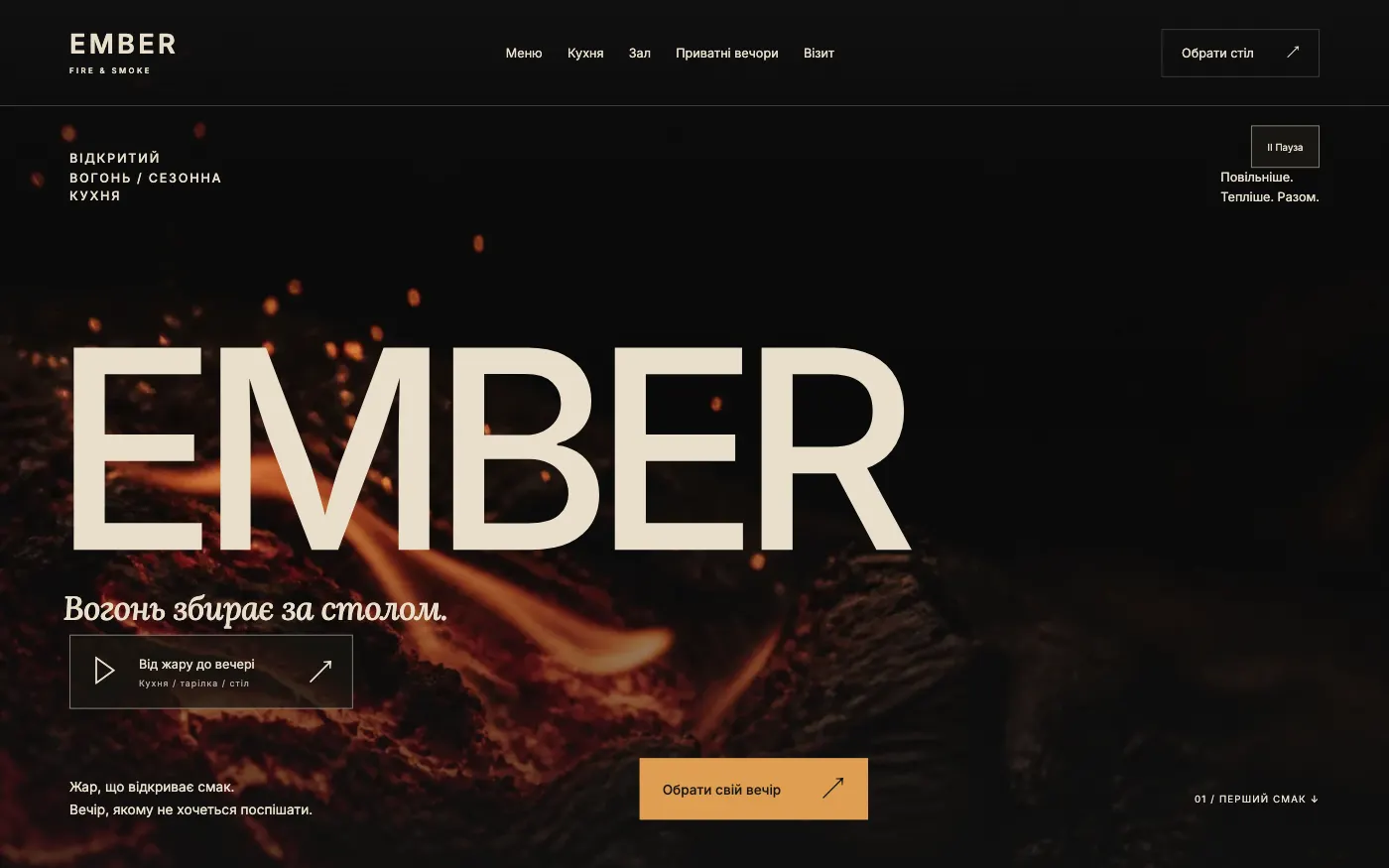
For a restaurant with an open kitchen and live fire. The site opens with a film from the kitchen and leads from a dish to choosing a table.
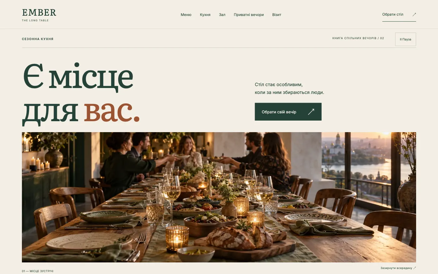
For a restaurant people visit in groups. A book-style site about the table where your people gather, with a separate path for evenings of 7 or more guests.
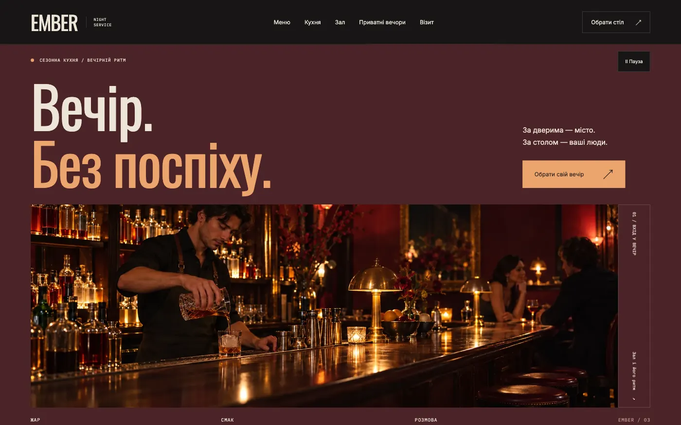
For a city evening restaurant or bistro. A site that follows the rhythm of service: first a “check” with guests and seating, then booking.
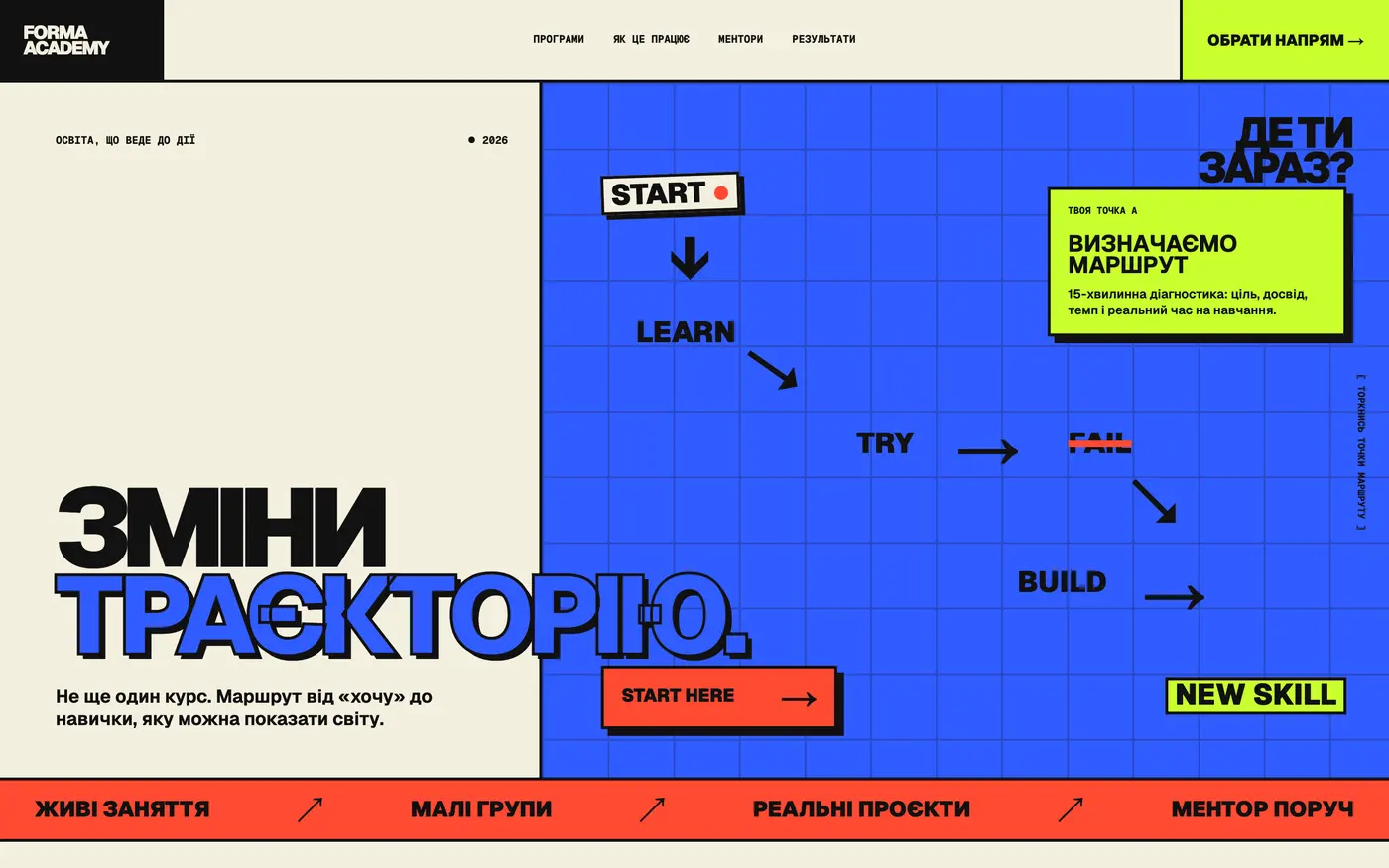
Courses lose when they look like courses. The site shows not just the program, but the path from the start to the result.
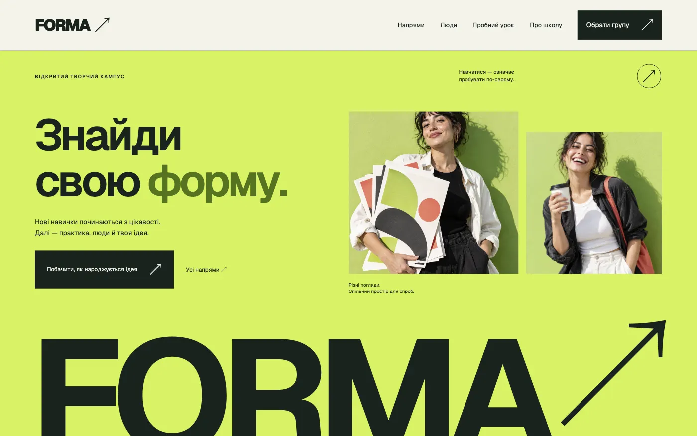
A creative school website that lets people try the learning before they apply: an open lesson, group selection and a three-step enrolment.
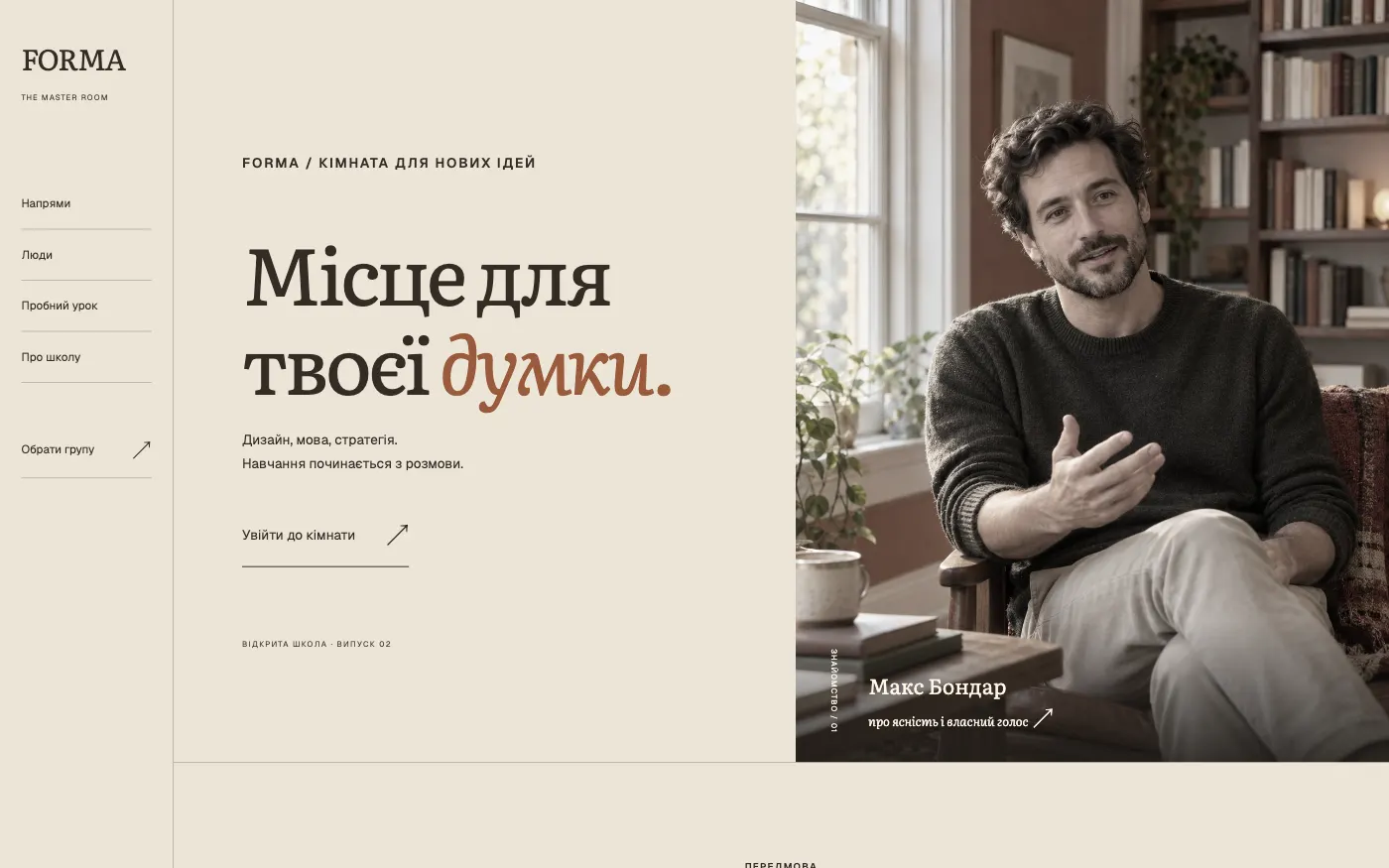
A school website where the mentor comes first. A warm editorial style, a short film and a notebook show what learning with a mentor is like.
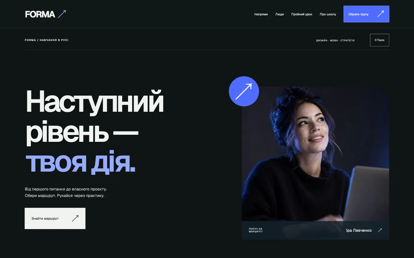
An online school website that presents learning as a route: from a task to your own solution, with numbered tracks and group enrolment.
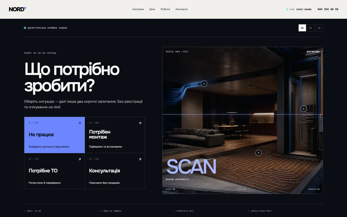
For installers of air conditioning, heating and ventilation. The client sees that the equipment is barely noticeable in the room — and stops being afraid of it.
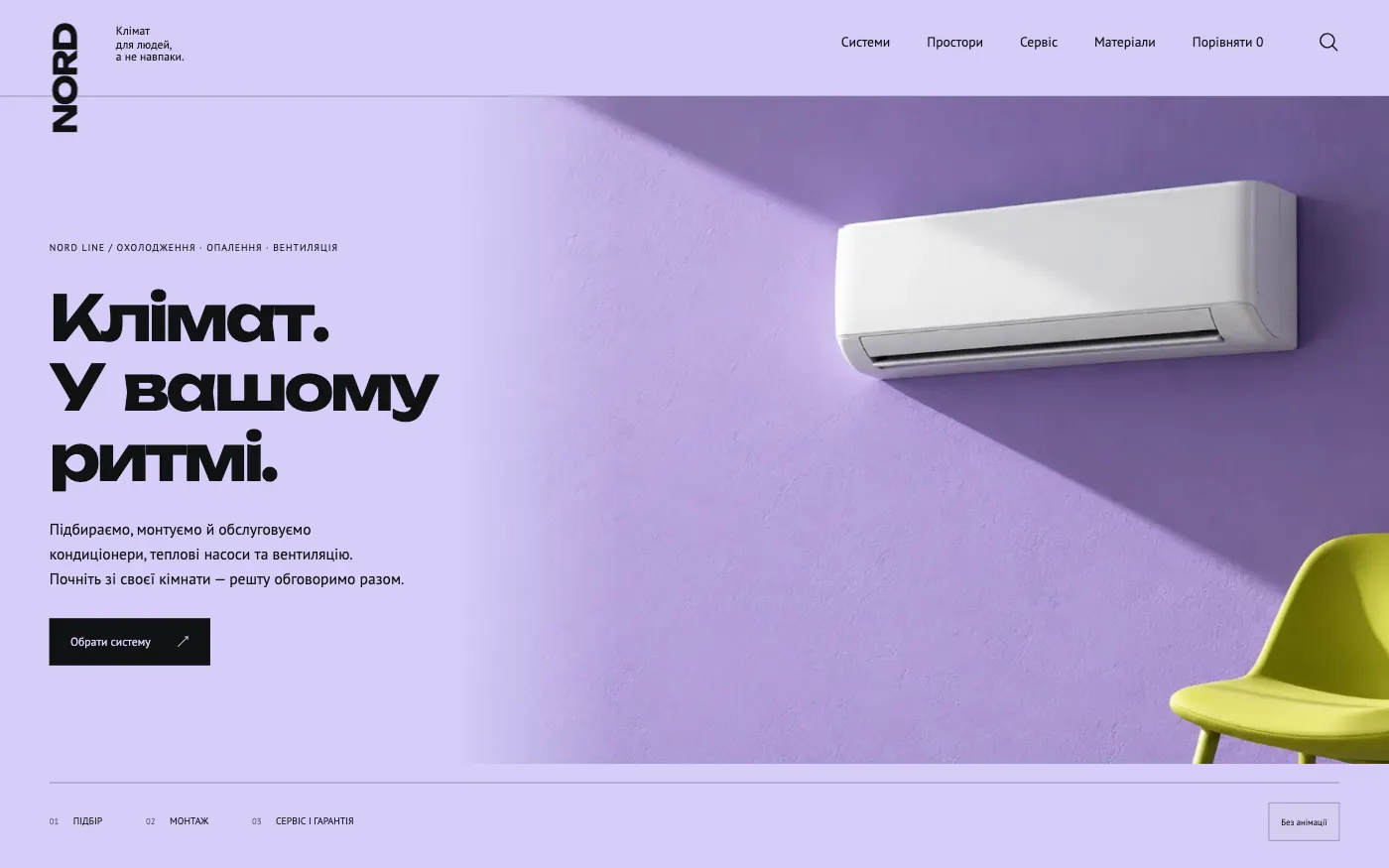
For a showroom of designer air conditioners. The site presents the unit as an interior piece and shows it both in the room and up close.
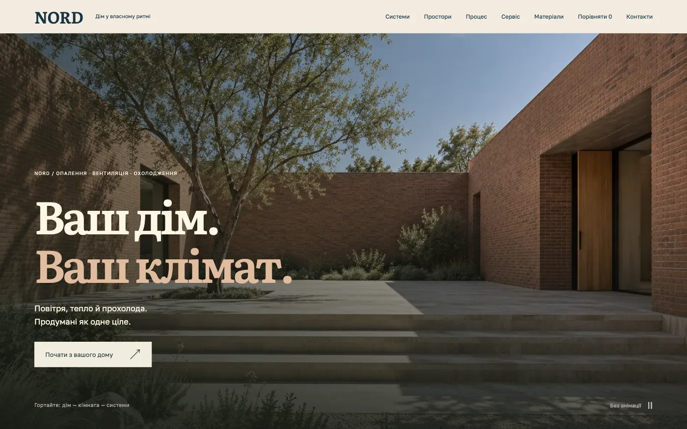
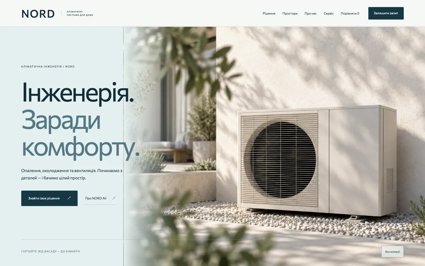
For an engineering company that delivers a home’s climate turnkey. The site shows cooling, heating and ventilation as a single system of the home.
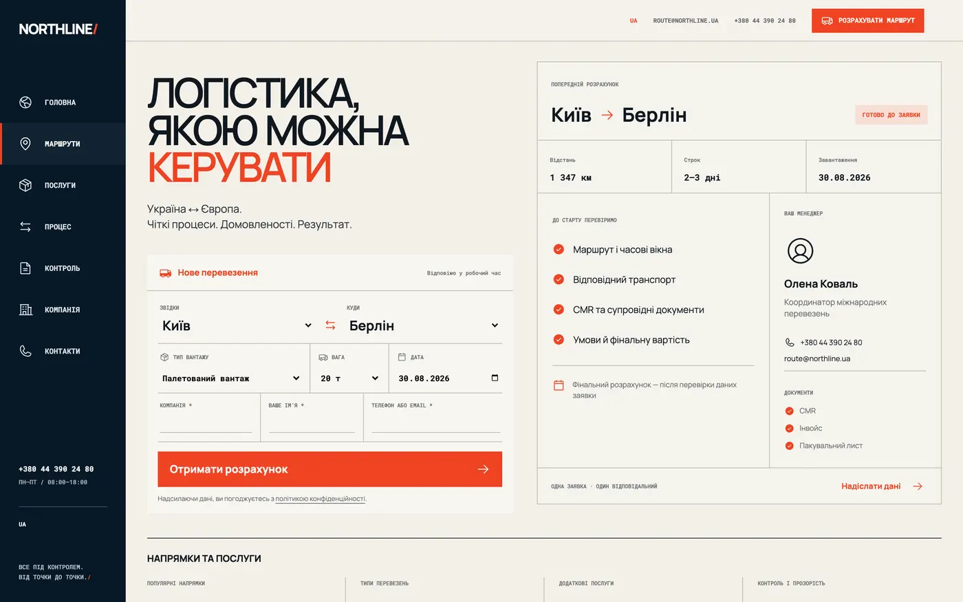
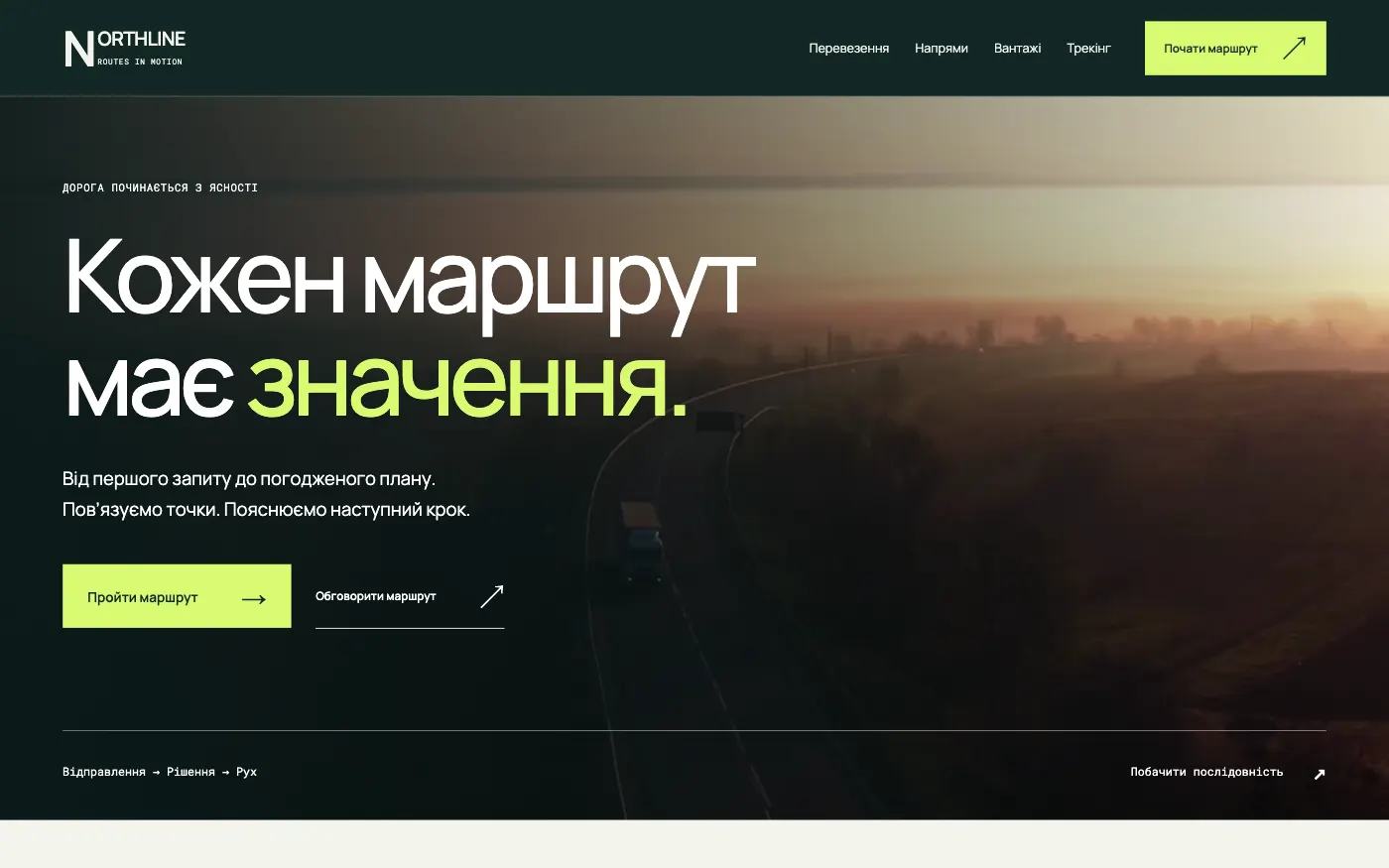
A multi-page carrier website that leads from the road to the request: route, format and cargo details come together in a single enquiry.
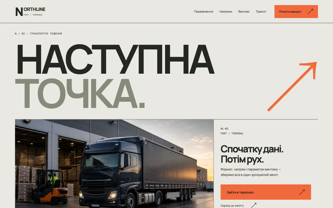
A freight carrier website in the industrial look of a terminal: from cargo type to consignment note without unnecessary calls.
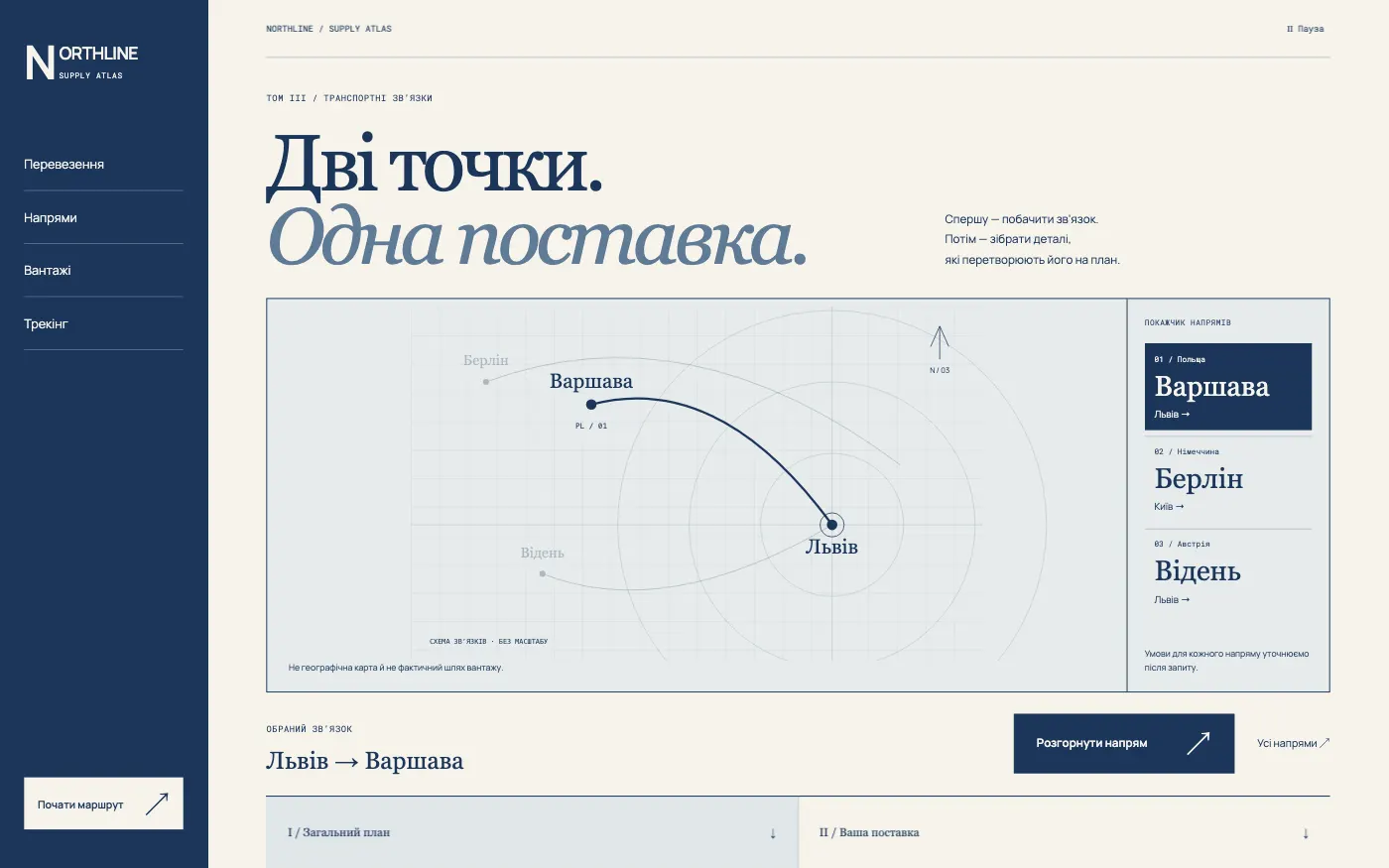
A logistics company website in the format of a supply atlas: a route map, a transport brief and a request in one calm path.
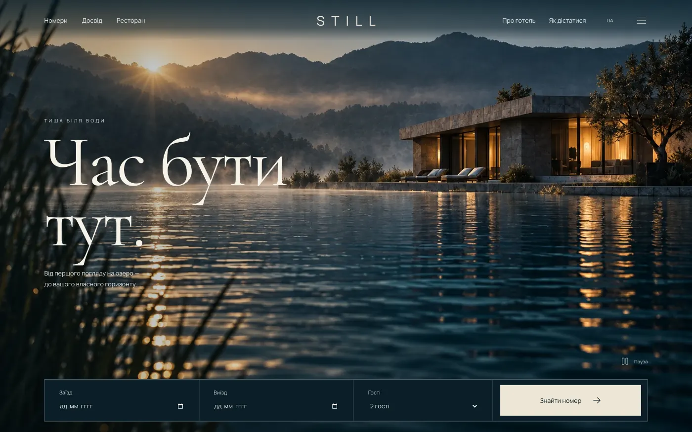
A website for a country hotel by a lake: the guest sees the water and their room and can work out the cost of the stay right away.
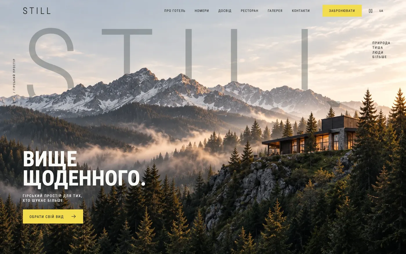
A website for a mountain hotel: a vast sky, a ridge panorama and 18 seconds of forest from above, before choosing a room with a view.
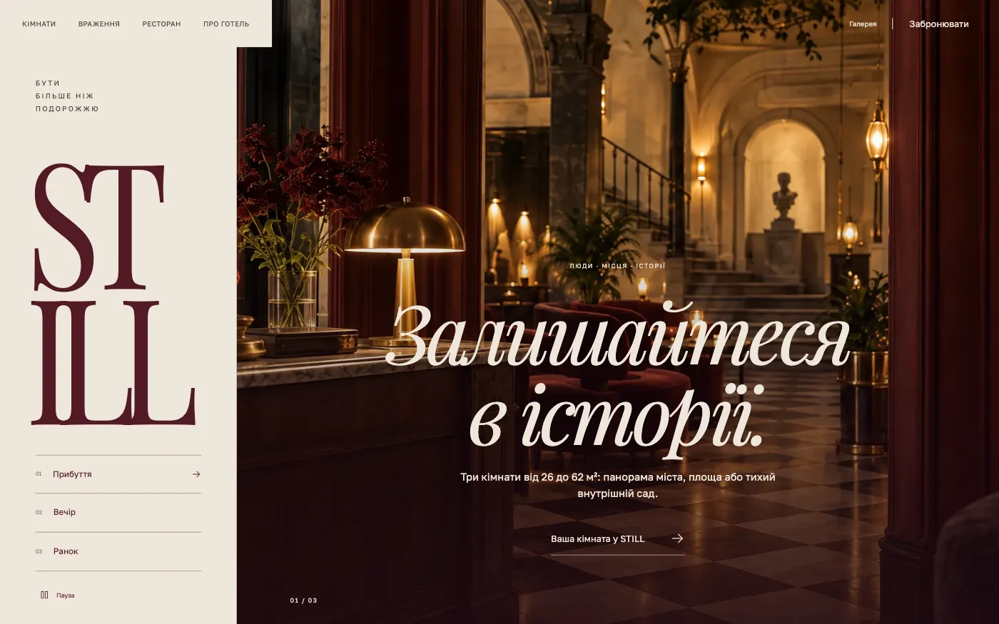
A website for a city boutique hotel: arrival in the lobby, an evening in the city and breakfast by the window, three scenes before choosing a room.
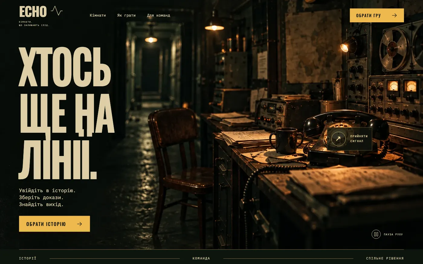
A website for a thriller and detective escape room: the player is met by a radio booth and “receives a signal” on the very first screen.
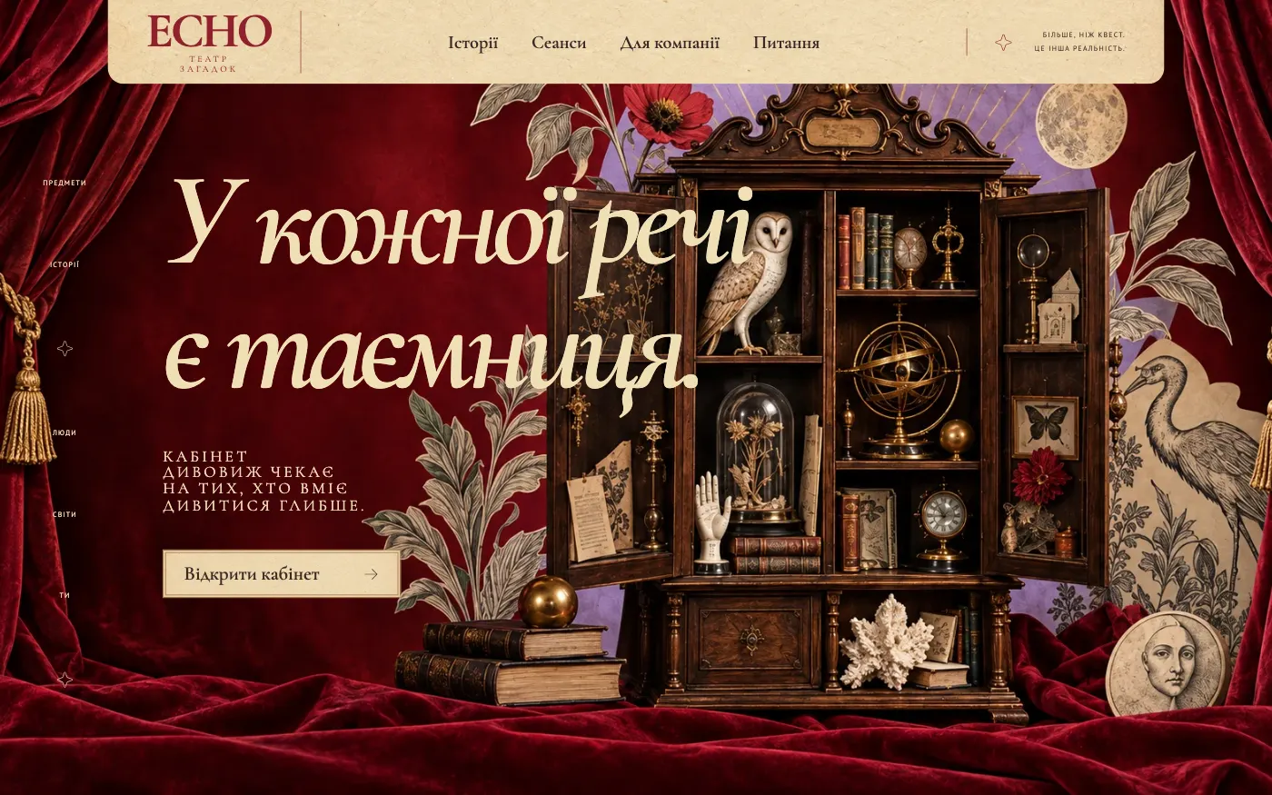
A website for a theatrical escape room: three stories are presented as acts in a theatre programme, and booking works like a ticket in three steps.
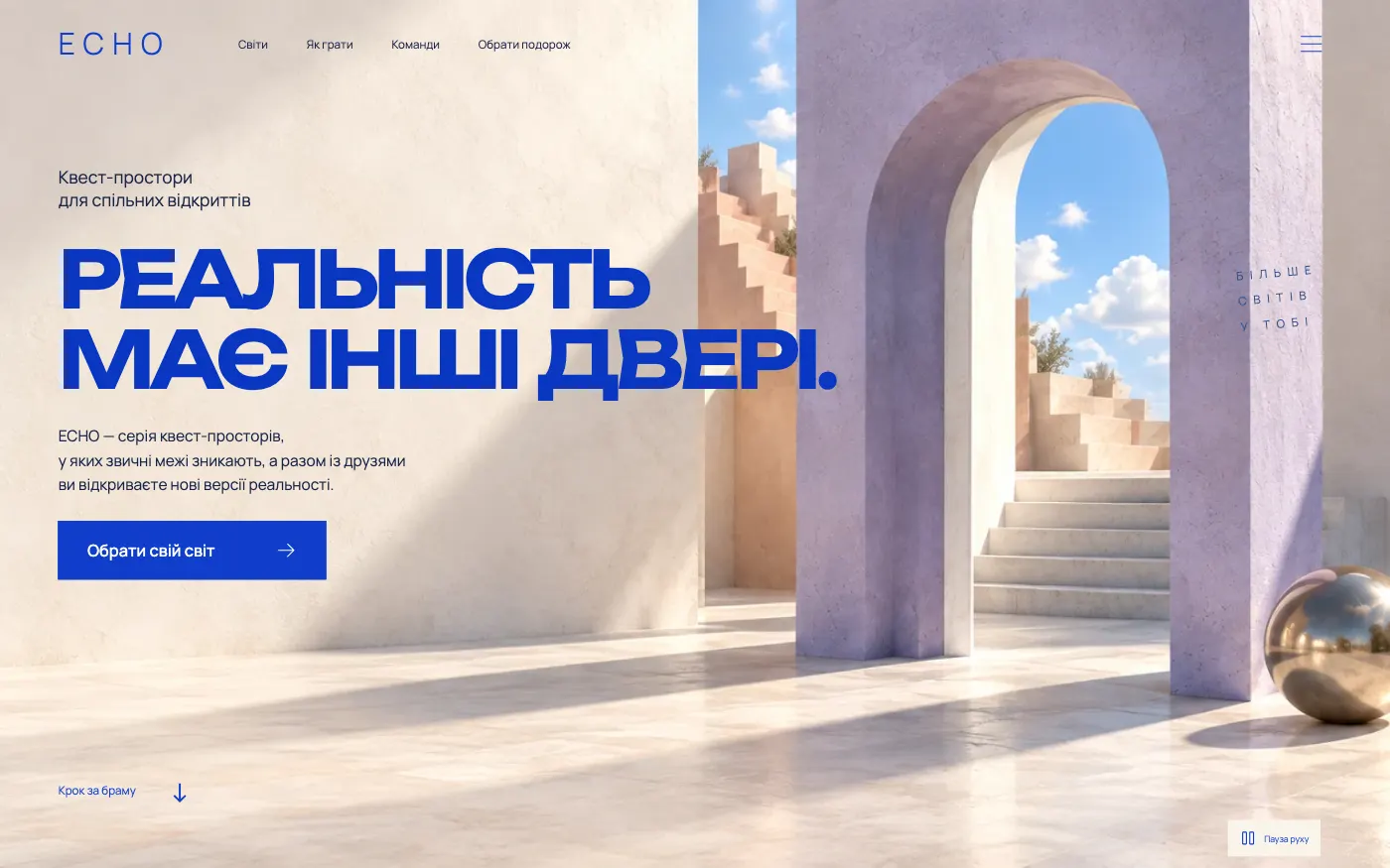
A website for an escape room with surreal worlds for friends and families: a bright gate on the first screen opens three different realities.
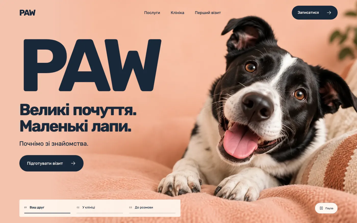
A warm website for a cat and dog clinic: the first visit is explained in simple steps, and the request is built in three stages.
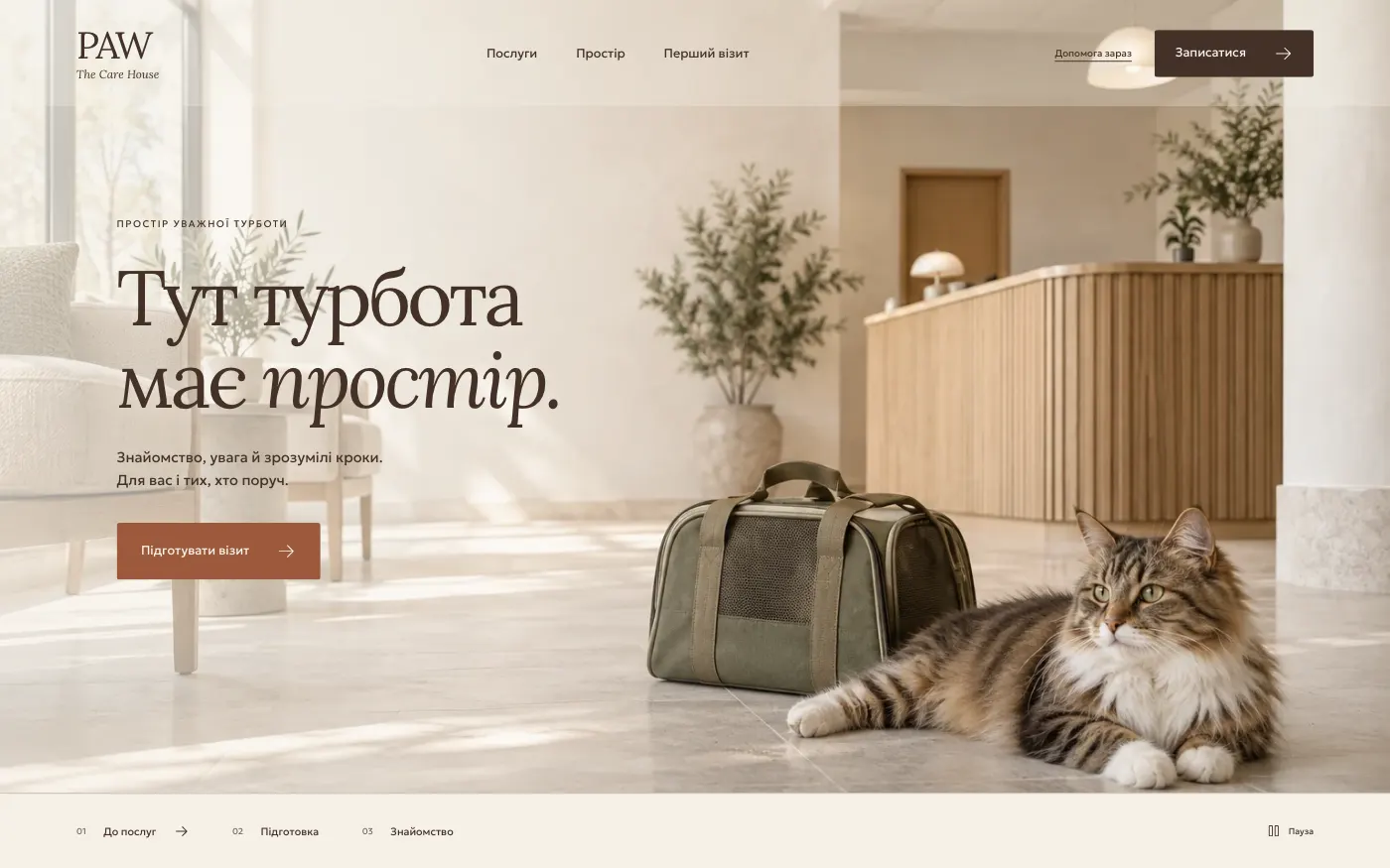
A restrained, architectural website for a vet clinic: the space, the preparation and clear steps before the first phone call.
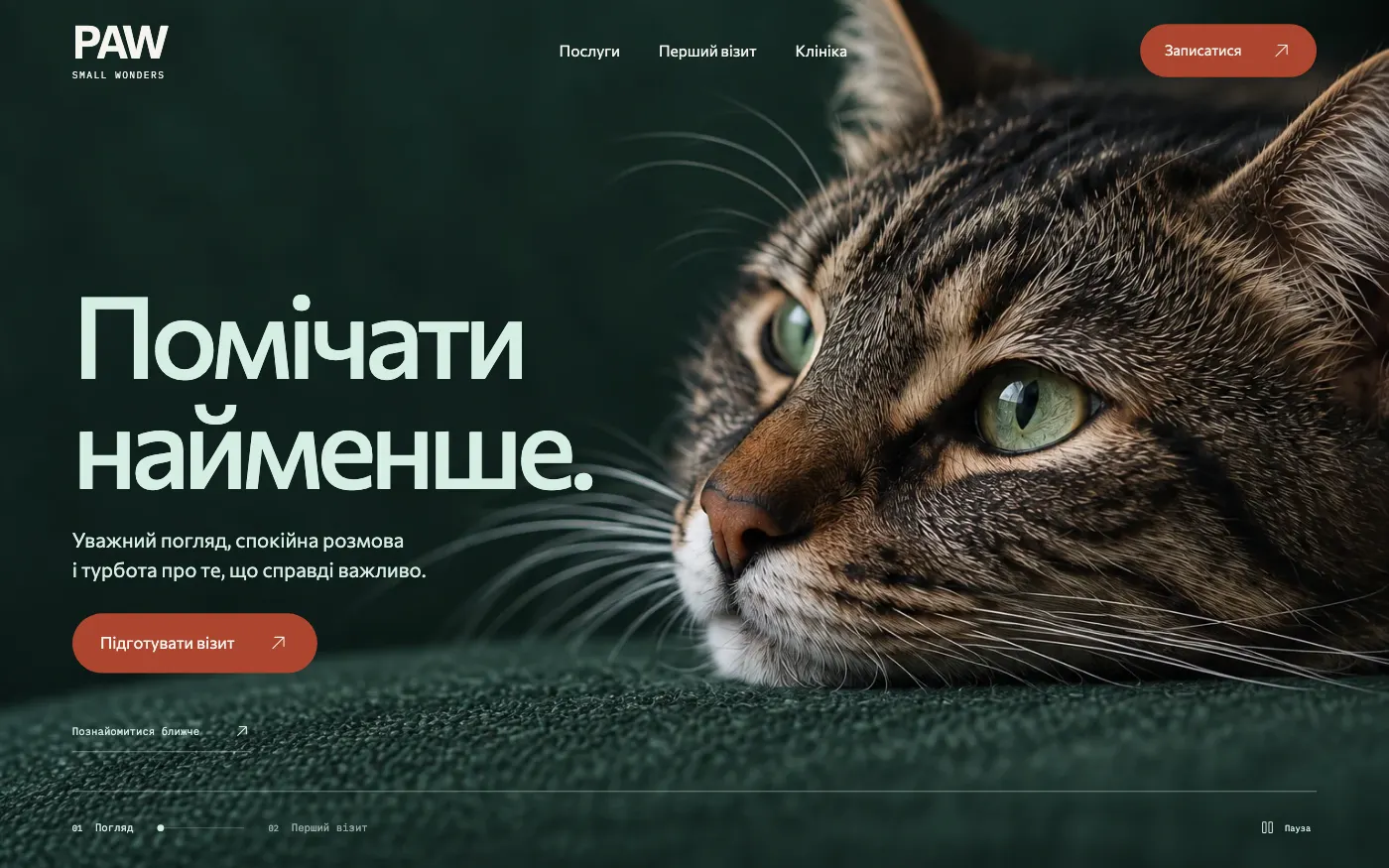
An editorial website for a vet clinic that sells attention to detail: macro photos of animals, calm conversation and a clear next step.
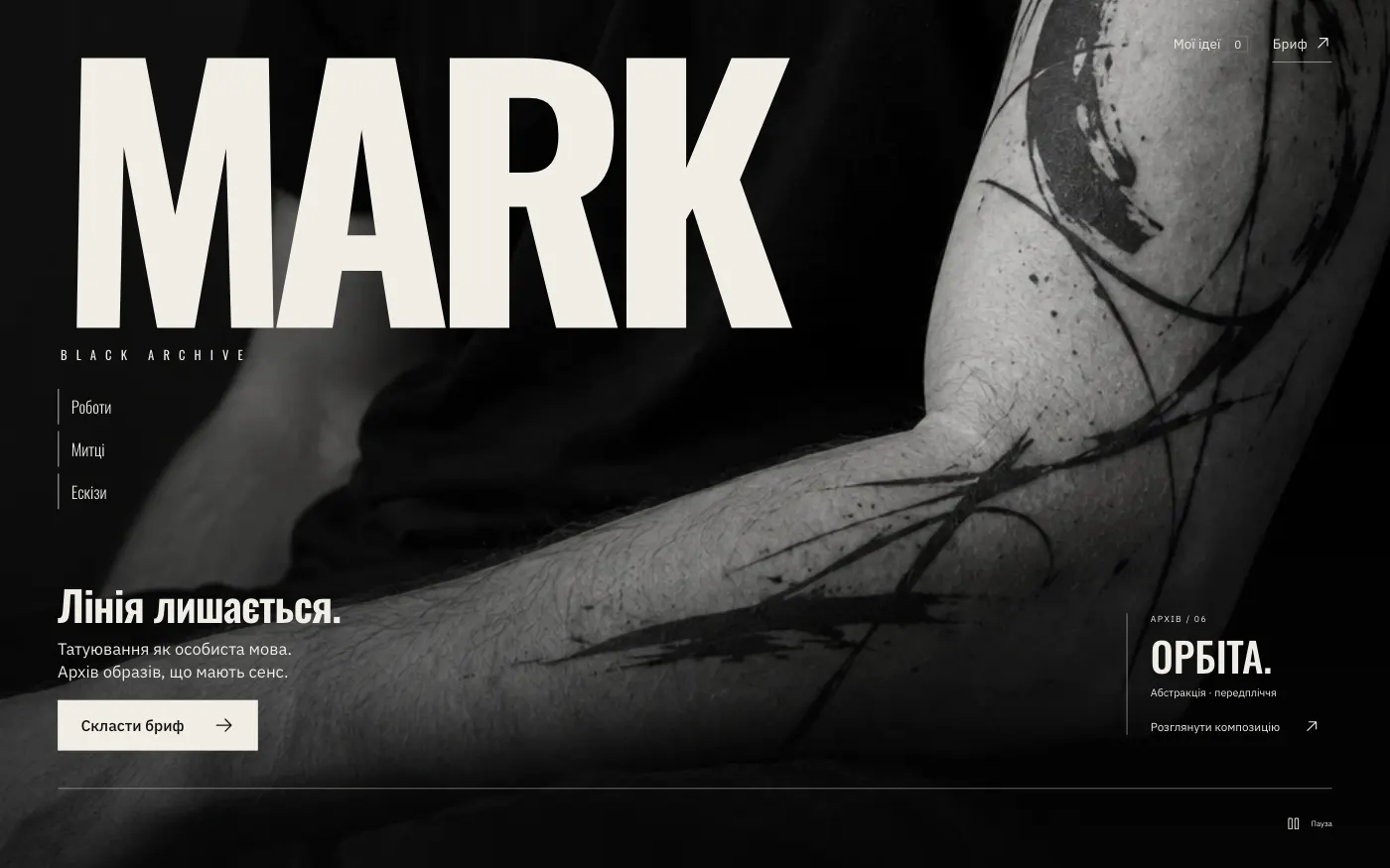
A tattoo studio sells more than a session: it sells a personal language on skin. A monochrome archive of work brings the client to a brief before the first conversation.
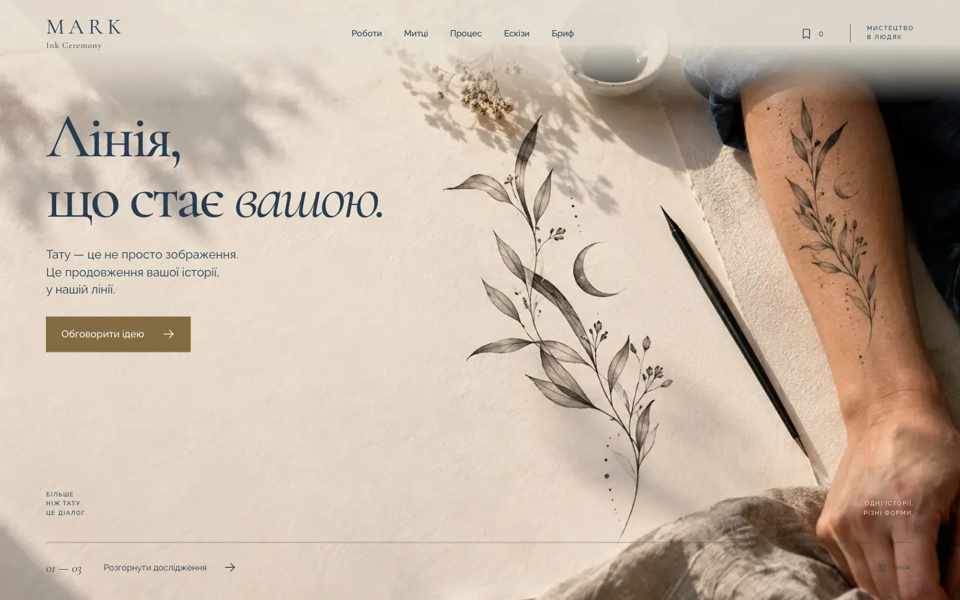
For a tattoo atelier where a tattoo begins with a conversation. The site leads the client from a sketch on paper to an idea on the body, calmly and without pressure.
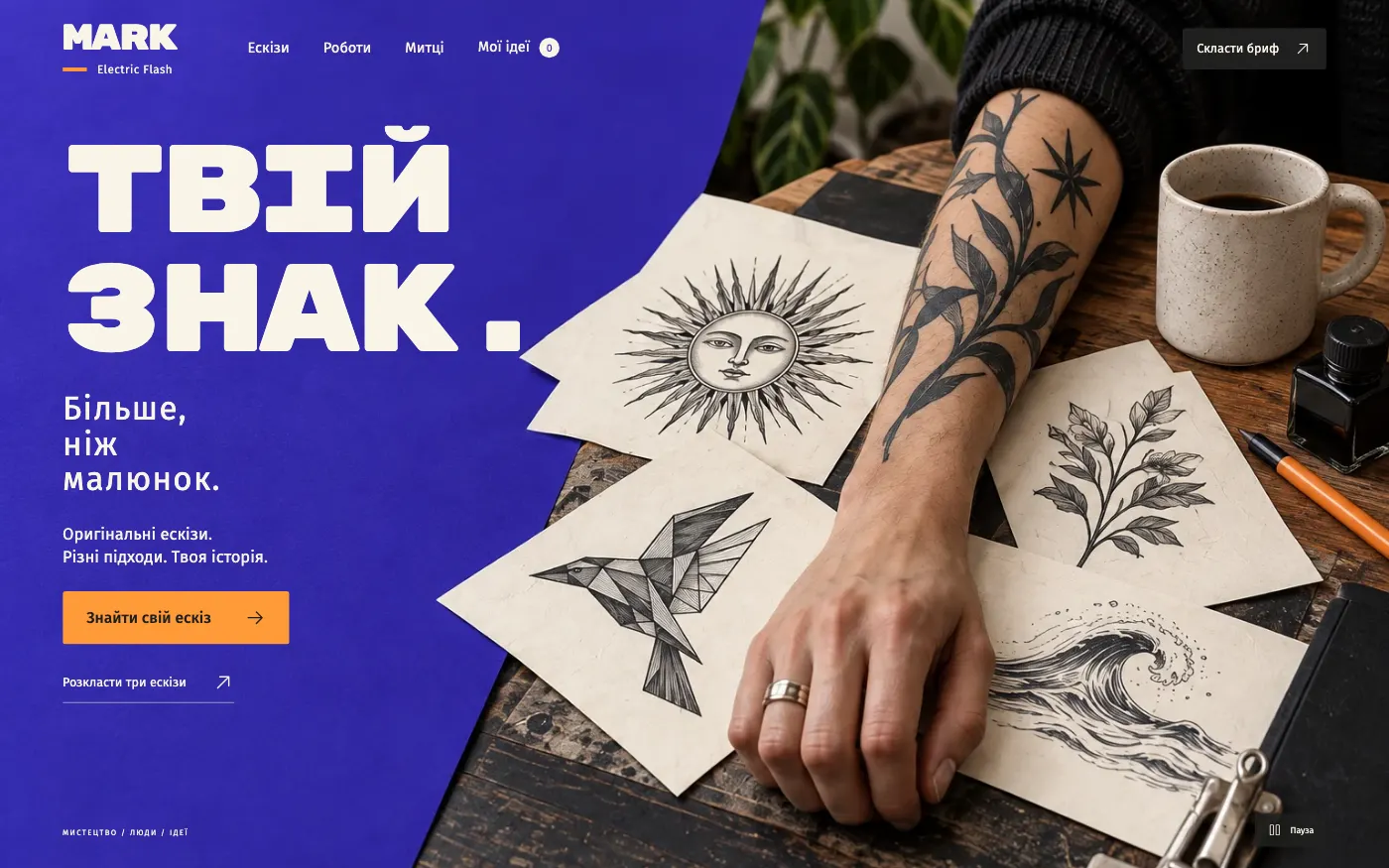
For a tattoo studio that sells flash: ready-made original sketches. The client picks a design, sees it on the body and builds a brief straight away.
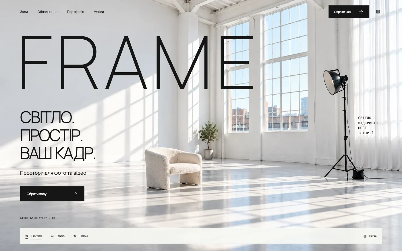
For a daylight photo studio that rents out halls by the hour. The site presents each space as a technical sheet and calculates the session cost on the spot.
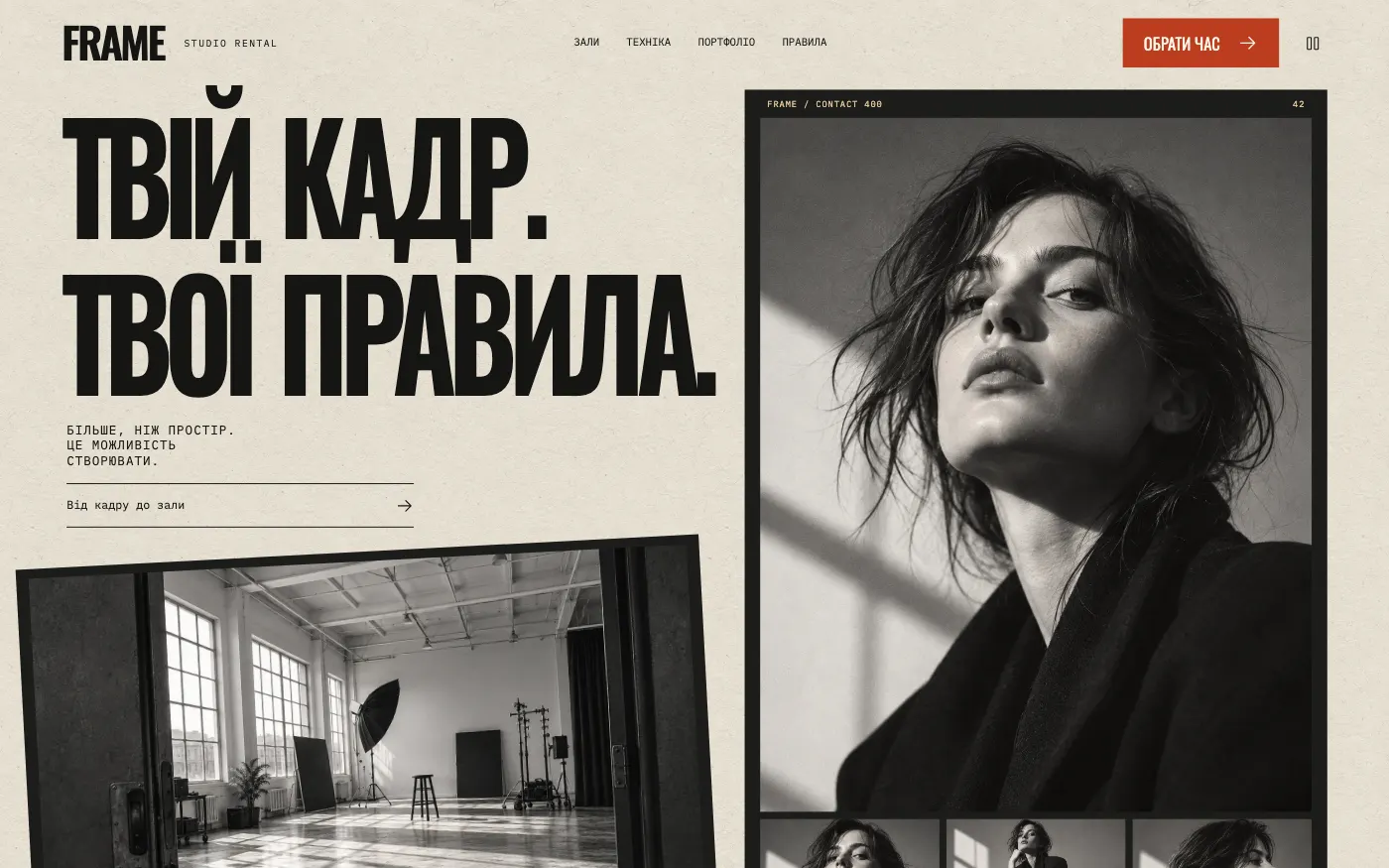
For a photo studio with an authorial character and a film aesthetic. The site speaks the language of the contact sheet and calculates a session on a single call sheet.
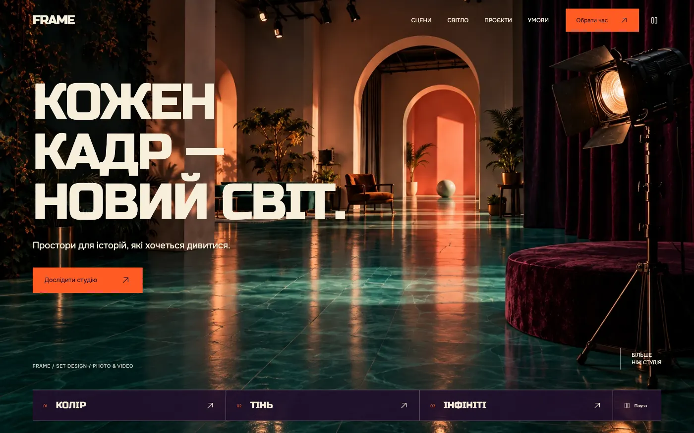
For a photo and video studio with built sets. The site sells a ready-made scene for shooting and calculates the session together with lighting.
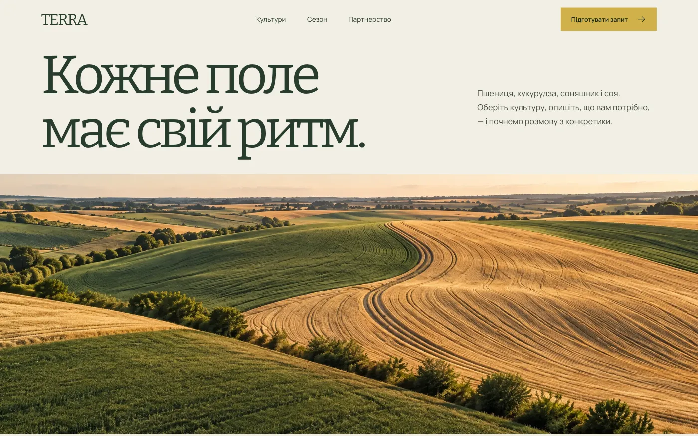
For an agricultural company that buys and sells grain and oilseeds. Instead of a call asking “what do you have?”, you receive a request with the crop, volume and timing.
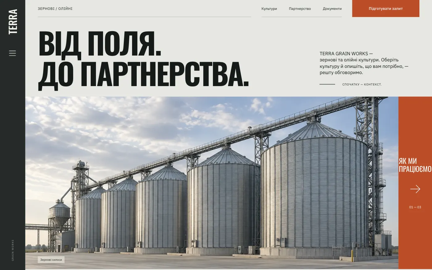
For a grain trader or elevator. A strict industrial site: a buyer or supplier sees the documents first and then builds a clear request.

For an agricultural company that wants to look like a modern brand, not a price list. Crops are shown large and beautifully, and lead to a business request.
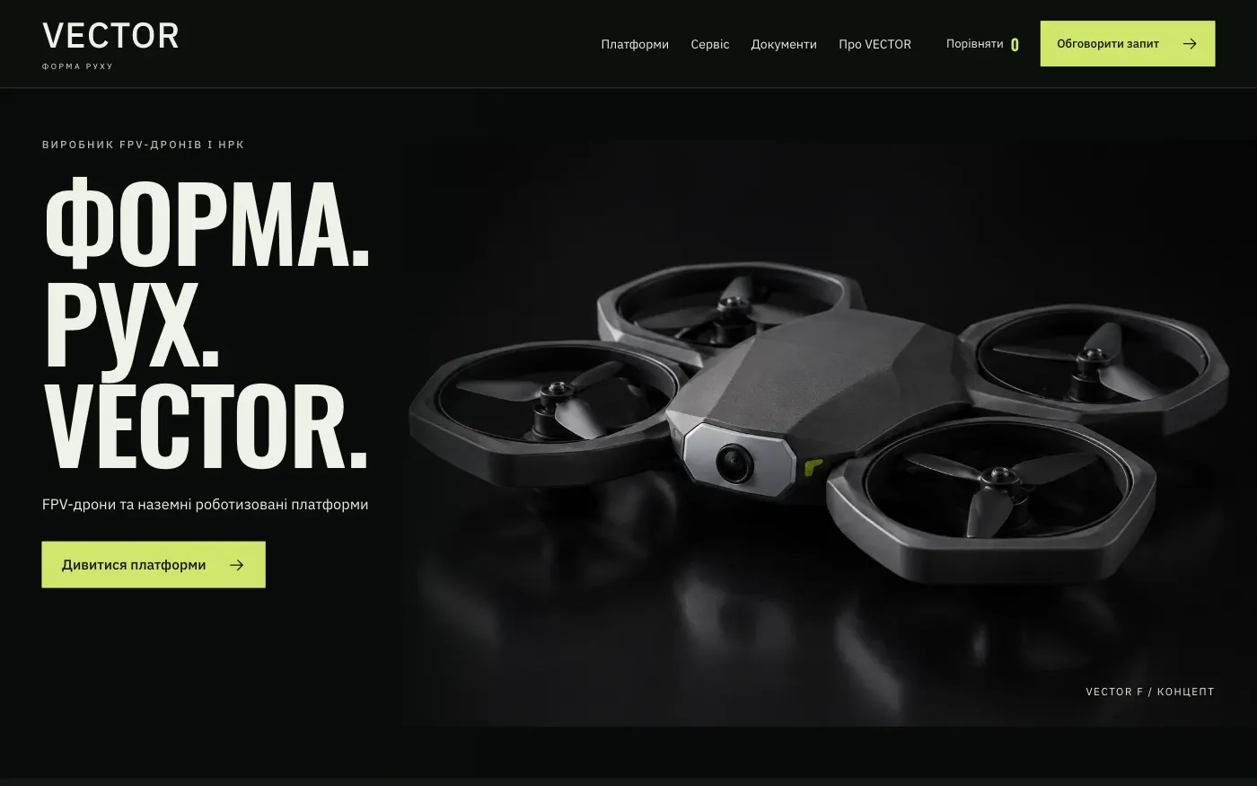
For a manufacturer of FPV drones and ground robotic systems. The catalogue shows what the equipment looks like and takes requests by topic.
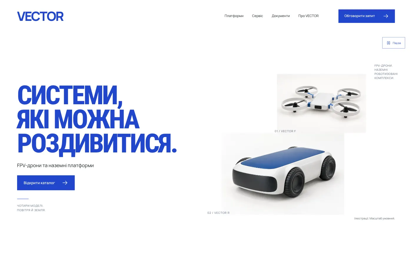
For a drone and ground robot manufacturer that needs a clean, restrained catalogue. Every platform is shown from three angles, with no invented specifications.
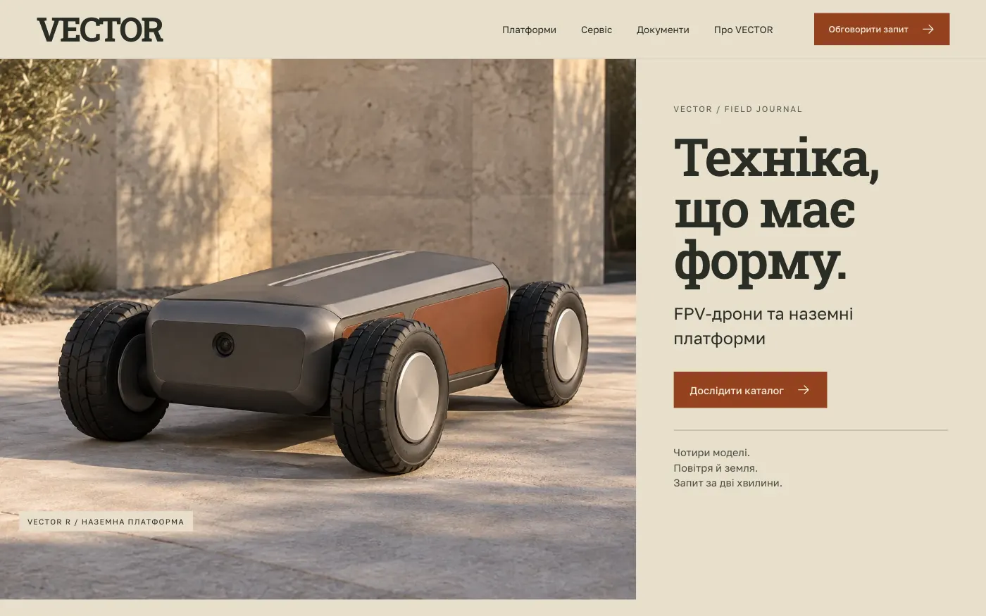
For a drone and ground robot manufacturer that wants to show its equipment in a real setting. Photo stories about each platform lead to materials and a request.
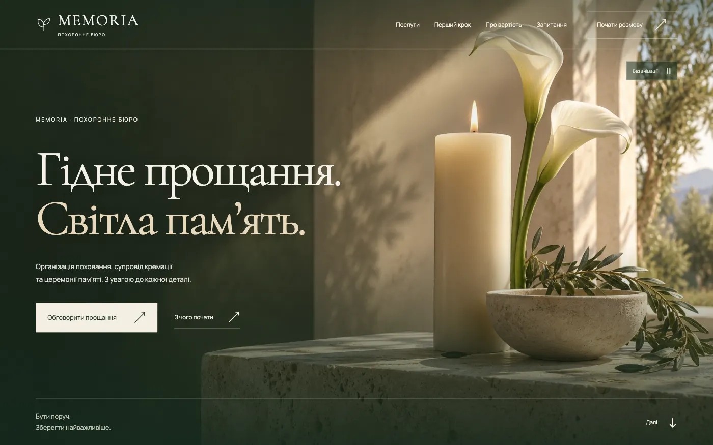
A funeral services website that speaks quietly: services, the breakdown of costs and the first step are explained so that the family never has to decide in a hurry.
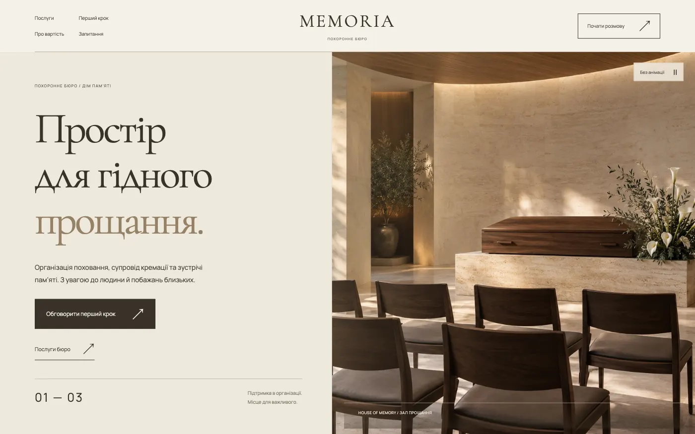
A funeral services website in the manner of a book of remembrance: restrained hall architecture, chapter pages and an honest explanation of what the services include.
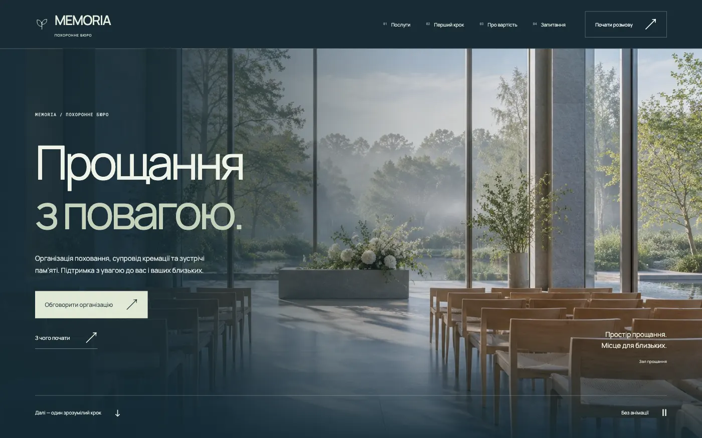
A funeral services website that starts with the question “What is needed now?”: three entry points, clear steps and an enquiry with no unnecessary decisions.
There is no site of this format in this niche yet. Message us — we will suggest the closest one or build one for you.
Prices
The price depends on the format: a single page, a full website or an online store. Prices are in US dollars.
Format 01
A one-page site from the collection, adapted to your brand and published on your domain.
$290
Included in the price
Format 02
A full website of 11–27 pages: services, team, prices, separate pages and online booking or an enquiry form.
$490
Included in the price
Format 03
Catalogue, product pages, cart and checkout — a ready-made store for your range.
$690
Included in the price
You choose a site → we adapt it to your brand → we launch it
Process
No weeks of approvals and no surprises at the end. From day one, you know exactly which website you are getting.
Open the demo, look through every section and the mobile version. Choose the one that suits you.
Logo, copy, photos, services and contact details. If anything is missing, we will tell you exactly what we need.
We keep the strong foundation of the site and adapt it to your brand and content.
We connect your domain, check the site and publish it. After launch, we hand over the code and access.
Technical base
Already built and tested in each of the 69 sites in the collection.
Optimised pages and images.
Local fonts, compressed images, no heavy libraries.A complete mobile version, not a scaled-down desktop.
Separate breakpoints from 320 px, tested on real devices.A technical base for correct indexing.
Metadata, Open Graph, sitemap.xml, robots.txt, structured data.You get the site and the code.
Source files, images and fonts. No subscriptions and no developer lock-in.FAQ
If your question is not here, message us — we will give a specific answer, not “it depends on the scope”.
Order
Send us the number of the website you like. We will clarify the details, tell you what we need from you, and fix the price and launch date.